RSE Spreading the Benefits of Digital Participation Inquiry

As we enter the last phase of the evidence gathering  process I wanted to draw your attention to the Royal Society of Edinburgh Spreading the Benefits of Digital Participation Inquiry that I am part of.

The Inquiry is looking into use, non-use and under-utilisation of the internet in Scotland. In particular we want to know why people do not use the internet and how usage of the internet can be maximised in beneficial ways. This also means that we are really interested in factors around this such as digital literacy, understanding barriers to participation, motivations, etc.

Although I have already mentioned the Inquiry to lots of you individually I thought this would be a good time to blog about the Inquiry as we have several specialist sector and interest-specific sessions lined up including an Education Round Table next week (22nd August) that I would encourage you to sign up and participate in.

You can view details on all of our forthcoming sessions here.

For those unable to attend in person – or outside of these sectors/interest areas – you still have a few more weeks to submit a response to the Inquiry. At this stage I think we are particularly keen to hear from those in SMEs (Small and Medium-sized Enterprises), those with examples of successfully bringing new groups online or broadening use of the internet (hello all Social Media surgeons for instance!), and in speaking to those who are not online and who are willing to share their reasons and motivations for not using the internet.

You can respond online or you can submit your response by email or post – more information can be found on the RSE’s page for the Inquiry.

Participants at the Royal Society of Edinburgh Digital Participation Inquiry event in Hawick earlier in 2013.

Participants at the Royal Society of Edinburgh Digital Participation Inquiry event in Hawick earlier in 2013.

DeliciousShare/Bookmark

Crowdsourcing Your Neighbourhood at the Edinburgh Fringe

This time last week I was getting set for my first ever Edinburgh Fringe show as a performer, a Cabaret of Dangerous Ideas event which took place on Monday5th August at The Famous Spiegeltent on George Street, Edinburgh.

The Cabaret of Dangerous Ideas (#dangerousideas) is a strand of afternoon shows that describe themselves as “Debate, discussion and discourse in the company of some of the fiercest intellects this country has to offer.” That means academics, researchers and other clever people spending an hour talking about big ideas in a very intimate and characterful venue.

When I was invited to be part of the strand, by the lovely people at Beltane Network and Fair Pley, some thinking was required… the shows are a fantastic opportunity to reach and engage with new audiences but that meant showing something off that would have relevance to a broad range of people, not just those in UK HE and FE. And that’s when FieldTrip GB came to mind, and my EDINA colleague Addy Pope came on board to create the “Crowdsource Your Neighbourhood” event.

What is FieldTrip GB?

The FieldTrip GB logo.

FieldTrip GB is a new mobile phone app and authoring tool created by my colleagues. It’s origins lie in the need for those on fieldtrips to have access to good quality mapping (currently of Great Britain but hopefully we’ll expand to cover further geographical areas). So FTGB supports download of a high quality but entirely open source collection of map data.

But Fieldtrips also tend to involve the collection of data and that’s where FTGB gets extra clever with a custom authoring tool that enables you to create whatever data collection you need for your project or research. You set up a form for different data types then you sync your phone (via Dropbox) and, as if by magic, you will instantly find the new form available on your phone and you can save records to the app whether or not you are connected to the internet. Every form records your location but you can also edit this at the time – for when you can’t get quite close enough, conditions are dangerous, or you forget something that you want to add later.

The app and authoring tool was designed with some particular academic uses in mind, but we reckon it has huge potential beyond that…

So what was our dangerous idea

Well we wanted to challenge our audience by asking them what they would change about their own neighbourhood through crowdsourcing. We asked:

You can map anything, anyone, any issue, any opportunity in your hood…

What are YOU going to do? How will you make a difference to your neighbourhood?

This isn’t actually an easy question – especially with the existing set of sites like FixMyStreet, and iSpot – so we also put together an example of something that a number of our audience might want to explore: the public toilets of Edinburgh.

Image of a public bathroom sign in Edinburgh

The Public Toilets on the Mound, Edinburgh.

Now why did we pick public toilets? Well firstly when I asked friends, colleagues and the Twitterverse what they’d like to map public conveniences were mentioned several times. Secondly our audience was coming in for a Fringe show and, whilst all venues do have their own facilities, it is not unusual to find yourself in a very long queue or a very long way from a public bathroom at this time of year. In August Edinburgh’s population doubles so demand spikes making such a guide properly useful to visiting Fringe goers.

Image of a twitter conversation between the author and the eccentronic twitter account

A Twitter conversation highlighting @eccentronic’s request for public toilet information.

However there was another reason for picking public toilet: bathroom access can be a political issue. In a city as old as Edinburgh many public buildings and facilities have had a real challenge ensuring they are accessible and meet the requirements of the Equalities Act 2010. But there are guides to some accessible bathrooms already. Directory Inquiries provides an excellent listing of the special RADAR key-access bathrooms across the city for those with appropriate access (usually those with substantial physical disabilities – more information on the Disability Rights UK website). But not everyone has one of these keys, and not everyone needs entirely flat/ramp access to their bathrooms.

Blue Badge Style includes a specific guide to the Accessible Fringe, including public toilets.

So we knew we wanted to record what accessibility really looks like in the city – what is the distribution of public bathrooms that are wheelchair (or buggy) friendly and how many are there? But, with an awareness of conditions that reduce mobility but do not rule out the use of stairs (e.g. arthritis) we also wanted to capture accessibility in a more subtle way – which toilets have only a few steps versus many steps for instance?

Disability is a “protected characteristic” but there are other potential inequalities around public bathroom provision. Are there a comparable number of male and female public bathrooms for instance? Historically women were not part of public life and where older bathrooms remain in use this can still be apparent in asymmetrical provision – for instance the Mound public bathrooms include only male facilities. So we knew we wanted to capture the designated gender (if present), the distribution and the differences of any provision around gender and facilities.

On a related note we also wanted to know which bathrooms include baby change facilities, rest spaces and breast feeding spaces/rooms (as a very few do). And we knew we needed a few other more personal bits of data. Are there towels or handdryers? Is there a mirror (essential for Fringe performance make up checking for instance)? Are the bathrooms pleasant, clean, safe?

Screenshot of the SUN newspaper

A February 2013 Scottish Sun headline.

We also wanted to address some current Edinburgh politics. Edinburgh City Council, who also provide a thorough listing of bathrooms that they operate, are currently upgrading seven public toilets in Edinburgh city centre. They have announced that once those refurbishments have been completed they will charge 30 pence for use of the toilets. This has been a controversial move (see above) and potentially limits access to the bathrooms only to those who can afford to pay. The locations of these toilets do seem to coincide with areas with heavy tourist footfall so they tend to be well used but by locals as well as visitors to this city.

With the upcoming public toilet changes in mind we wanted both to record all of the Council toilets – already well mapped by Open Street Map – but also nearby facilities and, in all cases, what the current charge for using the bathroom might be. This would also enable us to capture public toilets not operated by the usual suspects (e.g. in shops, cafes, etc.) and what the terms of their use are – do you have to make a purchase or can anyone use them?

Turning the idea into a form for our phones

So, we had an idea. We knew what types of data we would want to collect. And we had an idea of how this data might be used: on a practical basis; for campaigning; for assessing planning decisions and changes; etc.

Next, we used the FieldTrip GB Authoring Tool to create a suitable form.

Screenshot of the fieldtripGB authoring tool

The FieldTrip GB Authoring Tool in action.

And with that we were ready to prepare for our show by getting out into Edinburgh and collecting data on public bathrooms. We wanted to make sure that lots of people could add to this data collection process so we had set up the form following the FieldTrip GB crowdsourcing advice, and that means that you can also add to our map of Edinburgh Public Toilets.

Start by downloading the FieldTrip GB App – you can click on this link or use a QR code reader with the image below:

QR code for FieldTrip GB App

Download FieldTrip GB via this link

Once you have downloaded the app you will need to login using our shared details.

Login: crowdsourcedhood@gmail.com

Password: n31gb0ur

You can now add to our growing collection of public toilets in Edinburgh – or you can add the public toilets in your own area, anywhere in the UK. I’ve made a short video to show you how capturing a new record works, see below.

Click here to view the embedded video.

The form to complete is “Public Toilets in Edinburgh”. We would, if you are in the city for the festival, also encourage you to take a look at the “Fringe Wildlife Spotter” form as well.

As myself and my partner toured the city collecting public toilet data for the weekends leading up to the Cabaret of Dangerous Ideas show I received an offer I just couldn’t refuse from one of those original  Twitter commentators. @eccentronic vowed to create a music video using the public toilet map to shoot scenes of perfomer despair – read more about this in their post on their “people-powered Edinburgh Fringe documentary”, Two Pints of Irn Bru and a Packet of Crisps. This now gave our data collection a new purpose: crowdsourced art!

You can view all of the toilets that we have mapped in a few ways. Firstly you could log into the FieldTrip GB Authoring Tool and clicking on the “View Records” tab.

Screen Shot of the View Records Screen

A view of the Edinburgh Public Toilets already mapped using FieldTrip GB.

Or you could take a look at the files exported from FieldTrip GB (accessible via the same Dropbox login):

screenshot of public toilets KML

A screenshot of the Edinburgh Public Toilets KML being viewed in Google Earth.

We have also taken the CSV file and imported it into Google Maps Engine Lite (removing the heading for the spreadsheet and sorting the entries by name but otherwise making no edits) to create a web-based map of Edinburgh Public Toilets which you can access here. This is also the map we suggest the lovely folks of Eccentronic use for their video as it gives the quickest overview of the data without login being required.

So, with a detailed map of Edinburgh’s Public Toilets to hand, a number of print outs of the data and images we had collected with us – to allow our audience to try out the app for themselves without having to leave their seats, our colleague and FieldTrip GB expert Ben Butchart, and a bag full of FTGB badges, we set off to do a Fringe Show!

You can view our presentation from the show here:


And audio will follow shortly, along with a link to that music video inspired by our data collection.

image of FieldTrip GB badges

FieldTrip GB badges created for the show and for future events.

We didn’t get a huge audience along but we had some great ideas about what people would crowdsource, from woodpeckers to bike paths to the best bars for students. I would really welcome your own thoughts on what you would crowdsource about your neighbourhood in the comments below or via the hashtag for this event series, #dangerousideas.

 :: Update: the Eccentronic video is now live here, new blog post on that to follow ::

DeliciousShare/Bookmark

Culture Hack Scotland 2013: We Are On Albert Drive

A few weeks back I attended Culture Hack Scotland 2013 at The Whisky Bond, a mixed art/culture/design space in Glasgow. I was aiming to liveblog the event but ended up too busy with the hack so I’m just finally setting them live now – do let me know if you have any questions or comments about our hack, it would be great to hear what you think!

The event is in it’s third year (my write ups of CHS2011 and CHS2012 are here on the blog) and now a well established part of the Scottish tech events calendar, with developers, techies, designers, and people who don’t quite fit any of those labels (including me) heading along to build something awesome in an intense environment.

nerdy fortune cookie message "By eating this, you are agreeing to our use of cookies"

Culture Hack Scotland is not the place for seriousness, behold the awesomely nerdy fortune cookies.

There are very few rules about what you can build at Culture Hack Scotland – as I am typing this post one team are broadcasting a two hour “Live & Hacking” TV show as their contribution to the event for instance – but a range of data are made available from arts and cultural organisations. One of the features of these events tends to be developers supporting each other through their hacks and this year one ambitious team have made a universal API for all of the data, as Linked Data. However with laser cutting, 3D printing, sewing machines and a range of musical instruments mean there is a real emphasis on physical projects this year: mechanical high-fiving over the internet; adventures on a static Arduino-enabled peddle bike; and something amazing involving a giant beautiful laser cut Scotland.

Image of an automatic bell ringing machine

Twitter-triggered bells. They chimed whenever #chscot was tweeted. This led to underhand tweeting late into the first night to wind up early hackers…

My contribution this year is a team collaboration with Akiko Koyabashi and Brian Macdonald. We have been working with the Albert Drive data, a series of tweets about the Tramway’s fantastic sounding year-long community participation arts project all based in and around Albert Drive, Glasgow.

image of I am on Albert Drive badges (in both English and Arabic)

I Am on Albert Drive badges (in both English and Arabic)

When I looked at the data sets likely to be available Albert Drive caught my eye as I was keen to do something visual with the tweets – and started off with a plan to create an animation of the conversations back and forth. But, having packed any number of drawing, lego and stop motion kit things, inevitably, change. When I came to look through the data properly on Saturday morning it didn’t seem quite right for that format. A lot of the tweets were from the Albert Drive accounts (@AlbertDrive and @neighbourhoodw2) reporting the events as they happened. There were retweets and replies but overall the tweets (a 7 day snapshot from the project) are more reporting than conversation. They have also been provided with only minimal metadata and excluding georeferences – although it’s not all unusual for people to elect not to share their location on tweets (which is why mapped tweet visualisations should always ring a few feint alarm bells).

pile of flyers

Flyers for Tramway’s Albert Drive project.

So, what to do? I started to read up more on Albert Drive and still thought the project was really interesting… I wanted to see if I could do something useful manually with the tweets perhaps… And then I was joined by Akiko, an Edinburgh-based architect who was keen to address Tramway’s core hope for Culture Hack Scotland: to have a lasting and impactful legacy for their project. Akiko was keen to do this through a physical presence of some sort and as we started chatting an idea began to come together. I would do something with getting those tweets on a map, locating them within their context. Akiko would design some form of awesome community-based physical experience/interface that would connect the real social world of Albert Drive to the archive of the Albert Drive project content. We both researched the project further, keen to find out what had happened in the arts project, how it had taken place, and how we could build on that.

I discovered that there was actually loads of additional content around the project – commissioned images, videos (shared across two youtube channels), tweeted images, sound clips… but lots of these were not connected up to the website and it was hard to browse or experience the project as a coherant whole. So I started pulling resources together. Meanwhile Akiko analysed the physical space of Albert Drive, it’s properties, character and key areas – she made this into a truly amazing Post It note wall.

image of laptop and post it wall

My laptop showing Albert Drive tweets with Akiko’s amazing post it analysis shown in the background. Also pictured: a very tasty lunch.

As Akiko and I were chatting about possible physical embodiment, and key moments and locations associated with the project it became clear that getting ALL of these properly on the map would be a super starting point to understanding The Drive. So, much of my Saturday Night was spent manually building a layer of Albert Drive public spaces – the shops, the religious buildings, the post boxes, etc. This was a very manual process. Running two browsers in parallel I used Google Map Engine Lite to map each item, with Google Street Map open in parallel for reference, for checking the location and name of shops, etc. A fair amount of searching and verifying locations was also required but soon the map was coming together.

Image of Nicola editing maps

Me, hard at work finalising KML files for We Are On Albert Drive.

As I progressed the mapping Akiko designed several possible options for a physical embodiment of the project. Should it be a mobile seat? Perhaps a touch screen interface. Could the data be somehow projected into a more intimate space – she sketched a sort of comfy armchair with umbrella screen above it. Should a treasure box be used? I had seen simple physical interfaces like this at the new Furniture Gallery at the V&A and Akiko found a number of fascinating treasure box art works but thinking this through further the practicalities of curating content and maintaining it didn’t seem quite feasible for a project looking to create a lasting record rather than actively continuing. And then Akiko came across the notion of Guerilla benches and began prototyping some fantastic designs…

Image of Brian coding at his laptop

Brian codes into the night…

Meanwhile… early in the hack – in one of the check ins – Brian had said he was keen to do something on health and wellbeing that might look at the impact of the Albert Drive project but had hit a brick wall with the non-georeferenced tweets. He knew we’d been working with the same data and, when his own project seemed to reach a dead end, he came over to chat. It soon became clear that our public spaces map and Brian’s Twitter API work thus far could be a perfect combination. I exported the Public Spaces map as a KML and worked on pulling all of the videos and images around the project (again very manually) into a new map layer. Meanwhile Brian worked on how to turn this into a real experience – how to navigate and view content and start to pull in Tweets.

Image of Akiko trialling physical interfaces

Akiko explores the potential of Makey Makey – a kit for turning anything vaguely conductive into a controller.

And working on the physical interface Akiko had, as we’d been foofing with the data, designed and begun construction on a fantastic sociable bench – you sit on it and view and navigate around the materials using very physical controllers running via the amazing Makey Makey human interface. The idea is for it to sit somewhere on Albert Drive – and be movable around various “guerilla” locations – and for conversations to start, for explorations of the project to be sociable and located.

Akiko worked on constructing the bench out of many layers of cardboard with clever Makedo parts (essentially reusable plastic construction parts) so that it was sturdy – and it was very study. She then commissioned the laser cutting folk to fabricate perforated screens for speakers, an acrylic sheet to use as a lightbox/projection screen, and plywood seat pieces which, via pressure pads, could trigger the bench to switch on/off.

Brian and Akiko constructing the hack

Brian experiences a breakthrough moment as Akiko wires up the bench just before the hack deadline!

Things started to come together. In addition to the Public Spaces KML I had finished a reasonable cross section of the images, videos and sound recordings as a new Albert Drive KML. Finally I set to work creating a last crowd sourcable map layer. Anyone could add to this public Albert Drive layer enabling the community to add their own new materials – tweets, videos, comments, whatever – onto the map. Brian had created a simple-to-use walk through using Google Street Map but bringing in each of these layers. He envisioned adding live tweets as an additional layer – building on his previous work – and that would also have been in place had time allowed.

When we finally attached the Makey makey and a Pico projector to the laptop the effect was magical. Akiko had created four controllers – forward/back/left/right – using 10p coins that appeared to be glued to the acrylic panel. Making contact with them triggered you to walk through Brian’s map interface – which projected up from a pico projector concealed inside the box. As you walked getting near to the objects I had been mapping – a tweet, a photo, a video or a landmark – triggered it to appear in parallel with the map.

Image of a map of Albert Drive

A map showing the Albert Drive tweets, images, video and sound objects I georeferenced for our hack.

OK there were a few bugs. I hadn’t managed to complete all objects on all of the layers and the crowdsource layer was more concept than content. Brian’s interface worked well but some object types weren’t happy – not all media embed codes are equal and working out the kinks wasn’t doable in the last hour. And Akiko’s bench was great but some of the physical controllers were more robust than others – in the end rather than use the pressure pad contacts we concealed the key earth connection in the perforated speaker housing as this was the only way to make a successful connection.

When it came time to demo our idea those loose connections and an overheating Pico projector let us down but Akiko did a great job explaining the concept. You can watch her presentation – and our collective attempts to fix the previously-beautifully functioning bench – in the video below:

Click here to view the embedded video.

You can also view Akiko’s slides – with some great mock ups of how the project would look in-situ – here: Albert Drive [PDF]

Whilst the demo didn’t go quite as planned we were able to show loads of our fellow hackers, arts organisations and interested others how the bench actually worked, with many delighted looks as people sat down, chatted, and proved how the sociable physical incarnation of the materials really added to the rich digital resources and fun 1st person map interface for them.

image showing a hand on the bench working the physical interface (10p coins)

Akiko demonstrates the 10p controllers as the screen shows both the map and an image of one of the churchs on Albert Drive.

We were delighted at what we had created and felt honoured to be commended by Simon Kirby, Professor of Language Evolution, University of Edinburgh and one of the three Culture Hack Scotland 2013 judges.

Image of several hackers looking at the bench

Tired hackers take a look at the We Are On Albert Drive bench being demonstrated when back up and running after our Show & Tell.

All three of us felt that the project needed to be local, relevant and alive. We each had different ways to do this. For Akiko that was about located and social experience, for me that was about getting a coherant path through the data based around geography, and for Brian it was about bringing in new and real time data in meaningful ways. It was a really inspiring team to be part of and I am really proud of what we all achieved in the time.

Huge thanks to Akiko and Brian for being just brilliant. Massive thanks are also due to the Tramway for inspiring our weekend with their date, and to the ever-amazing Culture Hack Scotland organisers at Sync for orchestrating another productive, creative, energising and inspiring Culture Hack!

Useful Links:

Find our more about Team We Are Albert Drive:

And finally…

Please enjoy these highlights from others’ amazing Show and Tell demos:

Image showing an audience watching a man on a bicycle

One of the hacks featured a bicycle wired up with sensors and Arduino to turn it into a controller for a video game – your cycling moves you around a skyscape where (in a more developed version) you would encounter birds flying.

image of a crowded room

The full audience of hackers, arts organisations and judges pile into the hack space to view a sound map made of astroturf, cardboard, sensors and bird sounds. A highly interactive and popular hack.

Three men stand on an astroturf and cardboard map.

The map in action: you step to hear the bird population of that area, many people stepping creates a kind of avant garde bird song.

The full write up of the event can now be found on the Culture Hack Scotland website – I highly recommend a browse through each and every one of the imaginative hacks dreamed up during the weekend.

For a more nostalgia-inducing overview do also take a look at Live and Hacking – a Saturday-morning Kids TV-style streaming production entirely conceived, prepared, filmed and broadcast during the hack (where you will also see me on Tweet reporting duty).

DeliciousShare/Bookmark

Twitter API Version 1.1 Switchover

In late May/early June Twitter finally took some long standing API components out of service as they switched to Version 1.1. This shift had been advertised for some time – and most developers should have already have made the appropriate changes – but the new API represents a couple of important changes so I thought it might be useful to review these.

The most significant change for many will be the final withdrawal of the last Twitter RSS feeds. The visibility of RSS was scaled back several API releases back (there used to be a link on each user’s page) but they remained available – and actually easier to call on – for  those looking for them. They have now been entirely switched off with Twitter redirecting interest directly to the (less easy to use/play with) API or the (much more tightly controlled) Twitter widgets and tools.

The withdrawal of all RSS feeds is understandable in business terms – Twitter will now be able to monitor activity around a tweet much more easily and to, perhaps, push promoted tweets more directly, but it is a frustrating move in terms of the openness and re-usability of Twitter data. The recent introduction of a much expanded suite of Twitter widgets plugs many of the gaps left by the RSS withdrawal however the switch off proper will be surfacing other custom scripts, embeds, etc. that still need updating or replacement.

Here at EDINA we needed to make some updates for the RSS switch-off. We display the most recent blog post (still brought in via RSS from our aggregated blogs) and tweet on the EDINA homepage as this gives visitors a sense of the most recent news and updates. For the Twitter update we have switched from a custom RSS feed from Yahoo! Pipes which aggregated and filtered content from the feeds for each of our 18 organisational accounts, to a widget highlighting the latest tweet from a Twitter List of our accounts. This new solution works reasonably well after some quick but crucial customisations to ensure a good fit with out homepage (whilst still obeying the Twitter display guidance), but the new widget, whilst convenient and Twitter-approved, does restrict our ability to filter out specific noise (retweets from other accounts, which may look more out of place on our homepage, in particular).

The EDINA Twitter list stream

The EDINA Twitter list stream

The other change to accessibility and flexibility of data is less obvious but also frustrating for those who like to do a quick and low tech mash up or prototype. Whilst Twitter have been using OAuth for some time this update ensures that effectively no Twitter tool, app or widget can use anything other than OAuth – rendering the RESTful API a rather different beast to use. With that last change in mind users of Martin Hawksey’s excellent Twitter Archiving Google Spreadsheet may want to make sure they have upgraded to Version 5.

Useful Links

DeliciousShare/Bookmark

Repository Fringe 2013 now open for registration – and social media participation!

This year I have the great honour of being Chairing Repository Fringe 2013 (#rfringe13), the annual unconference on all things repository related. There will be several posts appearing here over the coming months in the lead up to our three days (31st July – 2nd August 2013) of repository ideas and fun and that kicks off today as I’m excited to say that registration is now open!

Now, as my job title is Social Media Officer, you may be wondering about the connection between repositories and social media. However, I have been involved in the organisation of Repository Fringe for some years now both because of my own event amplifying skills (I wrote a book chapter on amplification of Repository Fringe 2009), but also because social media is increasingly important for link sharing, for scholarly discourse, for information discovery. That makes social media increasingly important for publications, for research impact and for the use and visibility of materials deposited in repositories of all flavours – see, for example Melissa Terra’s April 2012 post for the LSE Impact of Social Sciences’ blog on the impact of blogging and tweeting research papers ).

Repository Fringe also embodies many of the core social media values of enabling community participation and authorship. The event is designed by and for the repository community and everyone who registers (free of charge) is encouraged to participate at every level of the event, from organising, to presenting, to amplifying and, of course, socialising. For me this has always made each event an opportunity to use or try out social media with a really up-for-it community – who picked up and embraced Twitter early, are always keen to share their images, presentations and expertise; who surface new ideas and great new ways to use these technologies in their own professional contexts; and who always provide thoughtful questions and reflections on the ways in which repositories and social media can work together.

So, if you have an interest in repositories then please do register for this year’s event. And otherwise expect a few more posts on how we are using social media this year, why we have chosen to use the combination of social spaces we have, and what we have learned from this year’s event.

DeliciousShare/Bookmark

Pondering the Possibility of an Online Hack…

Over the last few weeks we have been mulling the possibilities of running an Online Hack for the Will’s World project. You can read more about the plans on the Will’s World blog where you will also find a survey that we would love you to complete for us or pass on to developer/hacker/creative colleagues and friends.

As mentioned in our Will’s World post the idea is to try and take the energy and creativity of an online hack event and translate that into something virtual not because we don’t like people, pizza, and coding through the night but because we recognise that type of format isn’t always right for people who may want to take part. That might be because an employer is supportive but can’t release a staff member for a full work day, it may be that they are available but cannot fund travel and accommodation, it might be that they have caring responsibilities that would make an in-person event much harder to fit in, or it may be that the venue isn’t sufficiently accessible for those with different physical abilities.

But there are also lots of other special things that we think an online hack affords. Running something online and with a cunningly chosen time/appreciation of time zones means collaboration across the globe – something the Open Source movement have been up to for years of course. And it can be much easier to start on a new hack when you know what software and hardware you have to hand (not to mention not having to travel with all your tech!), you know your internet connection is reliable and/or you’re used to working with it’s speed, and you have all that quirky personal creative stuff to hand – be it arduino kit, a fine selection of felt tip pens, a monster supply of gluten free brownies, etc.

Will's World Online Hack is coming soon..

Will’s World Online Hack is coming soon..

And the reason I wanted to post something about this process on my own blog is that we think this is a pretty innovative idea but one of the particular challenges comes from considering which suite of social technologies will work and combine best to ensure this event has the buzz, the energy and the relevance of an in-person meet up.  The survey is part of our approach to finding out what might work but I’d also appreciate any comments here about what you think would work best for real time collaboration?

For instance I’m thinking that Google+ may be an effective and fun tool to try out – particularly for managing multiple video streams – for this event but I haven’t had a good excuse to trial this on such a grand scale before so would love to know others thoughts on how well this works in reality for larger groups of participants. Please do any suggestions or comments on the hack idea either here or via the survey.

DeliciousShare/Bookmark

Visualisation Allsorts

I sometimes receive quite specific requests about social media, new tech or other slightly more tangental things.  A few weeks ago I was asked for advice on Visualisation tools for a research project and thought that others here might be interested in the tools, sites and resources that came to mind.

The links and recommendations come from a mixture of angles: some I’ve looked at or been aware of through specific work projects; some come recommended by colleagues as new, interesting, or well crafted; and some came from looking for visualisation options for my MSc in eLearning dissertation. Do let me know what you think of any of these tools or the list itself and I’ll be very happy to update the list if you have others to recommend!

Tools 

This section generally focuses on online tools (with varying policies over data use/retention) that allow you to visualise your data one way or another:

Wordle is about the simplest visualisation tool but can be effective if you want a word/tag cloud: http://www.wordle.net/

Image of the Closing Session at OR2012 with Wordle by Adam Field shown in the background.

Image of the Closing Session at OR2012 with Wordle by Adam Field shown in the background.

Textal is a new and more academically-targetted and mobile-friendly alternative to Wordle, specifically designed for use with text research data sets. I think it should be due out soon… : http://www.textal.org/.

FigShare is a site for sharing academic data, particularly scientific data. It includes some automatic visualisation functionality as well as inspiration via other people’s shared resources, graphs, visualisations: http://figshare.com/

ManyEyes is an IBM tool for visualising data – very useful and once data is uploaded it can be re-visualised: http://www-958.ibm.com/software/data/cognos/manyeyes/

Visual.ly is a consumer web 2.0 tool for visualising data – generally social media related data – and is probably primarily useful as a source of inspiration for other visualisations: http://visual.ly/

Google Apps/Drive includes a series of pretty good visualisation tools that can be accessed from any spreadsheet. Standard Excel type charts can be accessed via:

Insert>Chart

You can also access more sophisticated visualisations from

Insert > Gadget

There are various examples of these being used well on the web but they really come into their own when you hook up a data collection form to a spreadsheet and then visualise it – it all connects up rather nicely.

Voyant Tools offers a number of approaches to large cohorts of prepared text-based data. It’s worth noting that, as with all of these tools really, you should anonomise and edit the text before submitting it. That’s particularly important for Voyant Tools as you can’t edit the data once it’s up and you can’t delete it easily either. But it does clever stuff in a simple way and for free: http://voyant-tools.org/.

Data-Driven Documents is a site focusing on D3.js, a JavaScript library for working with data – lots of very practical but very technical materials and ideas here: http://d3js.org/

SIMILE Widgets are a great wee set of visualisation tools from a project at MIT that are relatively easy to reuse and widely used on websites to make swishy looking previews etc.: http://simile-widgets.org/

Timeline JS is a flexible way to create timeline visualisations – useful if that type of visual is what you’re after: http://timeline.verite.co/

Tableau is a free data visualisation tool and rather less techie tool to handle than many of those mentioned above. I haven’t had much experience of using it but have heard good things: http://www.tableausoftware.com/public/

SourceMap is a web service that lets you create one type of visualisation – maps visualising “where things come from” whether those be sources, commodities, trade routes, etc. Very useful but only if that’s the visualisation you actually want to create: http://sourcemap.com/ You can find some good examples of these visualisations over on my Trading Consequences’ colleague Jim Clifford’s blog.

British Tallow trade map by Jim Clifford (click through to see his full blog post about these maps).

British Tallow trade map by Jim Clifford. Click through to see his full blog post about these maps.

Gource is a specific version control visualisation codebase – again it’s very niche but nice is that’s your niche: https://code.google.com/p/gource/

Logstalgia is, similarly, a specific visualisation codebase for access log visualisation: https://code.google.com/p/logstalgia/

Dedoose is also worth noting. This is a text analysis tool and isn’t really a visualisation tool but there are visual aspects and it does help you reimagine and reinterpret text data by colour coding, tagging, grouping and viewing trends as you mark up your data: http://www.dedoose.com/


Useful Lists of Visualisation Tools and Resources

These are some articles and listings I’ve found useful in the past – I suspect there are many more to add…

The Next Web did a great guide to visualisation tools in May 2012 (some of which have already been mentioned): http://thenextweb.com/dd/2012/05/10/want-to-make-your-own-data-visualizations-check-out-this-awesome-set-of-tools/

ComputerWorld also shared a very useful post on good free data visualisation tools. The article is here: http://www.computerworld.com/s/article/9215504/22_free_tools_for_data_visualization_and_analysis and you can view a chart of all of the tools featured here: http://www.computerworld.com/s/article/9214755/Chart_and_image_gallery_30_free_tools_for_data_visualization_and_analysis

GoGeo (http://www.gogeo.ac.uk/) includes a visualisation software area where you can find several useful tools: http://www.gogeo.ac.uk/gogeo-java/resources.htm?&searchcat=Software&search=visualisation. There are also a number of useful collections of geographically related visualisation tools featured in the news section: http://www.gogeo.ac.uk/gogeo-java/resources.htm?&searchcat=News&search=visualisation

Downloadable Software

I must note two fabulous blogs for finding out about these: Tony Hirst’s OUseful blog; Martin Hawksey’s MASHe blog. Both are brilliant resources and contain many many more recommendations for software for visualisation and data analysis.

R – Free software for visualisation: http://www.r-project.org/

Gephi – Powerful – but complex to start out with – open source tool for data visualisation: http://gephi.org/

Expertise – Technical

These are useful website

Visualizing.org is a site dedicated to visualisation and includes a wealth of examples and useful links – very worthwhile browsing this for ideas, practical solutions etc: http://www.visualizing.org/

Visual Complexity is a collection of best practice visualisations which can be searched, browsed, etc: http://www.visualcomplexity.com/vc/

FlowingData is a blog collecting best practice visualisations and usually also indicating technology used: http://flowingdata.com/

Visualisation of Facebook photo virality featured on Flowing Data. Click through to read the full article.

Visualisation of Facebook photo virality featured on Flowing Data. Click through to read the full article.

There are also some individuals whose blogs are always well worth a read:

Steven Gray specialises in working with data and geospatial data visualisation with several very interesting current projects (including Textal). His Big Data Toolkit website http://bigdatatoolkit.org/ includes updates on his research, links to useful resources, discussion of ideas, etc.

Melissa Terras is co-director of the Centre for Digital Humanities at UCL and has worked on a variety of visualisation, research and interaction projects around Digital Humanities, including Textal, which can be found on her website: http://www.ucl.ac.uk/dis/people/melissaterras

Martin Hawksey (already mentioned above) of JISC CETIS blogs at MASHe (http://mashe.hawksey.info/) and often examines data analysis and visualisation including some superb work on Twitter data and visualisation. A search or browse of his blog for visualisations should find some interesting examples using web and downloadable data visualisation tools. As with any of these notable folks he is likely to respond to comments or questions so do comment on his blog!

Visualisation of UK University Twitter Following patterns by Martin Hawksey. Click through to read more about this visualisation and view his and Tony Hirst's IWMW 2012 presentation on Data Visualisation.

Visualisation of UK University Twitter Following patterns by Martin Hawksey. Click through to read more about this visualisation and view his and Tony Hirst’s IWMW 2012 presentation on Data Visualisation.

Tony Hirst (already mentioned above) of the Open University blogs at OU Useful (http://blog.ouseful.info/) and his posts often revolve around visualisation of data, particularly social data. I would recommend having a browse around his site (e.g: http://blog.ouseful.info/?s=visualisation) and leaving comments/questions.

Aaron Quigley of St Andrews University (http://www.cs.st-andrews.ac.uk/~aquigley/) is an expert on Human Computer Interaction and shares great resources and ideas around HCI and visualisation regularly. Aaron is also working on the Trading Consequences project and occasionally blogs about visualisation plans/issues related to that project here: http://tradingconsequences.blogs.edina.ac.uk/

The giCentre at City University London looks at geographic information and visualisation is a major part of that work. Their projects – which have included special commissions for the BBC and others – and related materials can be found here: http://www.soi.city.ac.uk/organisation/is/research/giCentre/

Patrick McSweeney of University of Southampton has worked on a couple of nice visualisation projects and hacks – notably his OR2012 Developer Challenge winning concept of provenanced visualisation within/connect to the repository  – and usually shares the technologies behind them. You can browse recent projects here: http://users.ecs.soton.ac.uk/pm5/portfolio/projects/


Expertise – Artistic/Creative/Inspirational

This section focuses on those who offer visual inspiration and expertise. I had hoped to include Douglas Coupland who worked on a very creative data visualisation project a few years back but I can’t recall the name of the project nor find the link – do let me know if you can help me out with a link here.

Hint.fm is a site collating new ways to visualise data of various sorts. This is about novel artistic rather than automated approaches: http://hint.fm/

Information is Beautiful, which I’m sure you’ve all seen before, is the home of David McCandles’ work and is really useful for inspiration/artistic visualisation and interpretation of data: http://www.informationisbeautiful.net/

Pinterest includes a number of visualisation boards that may be useful as inspiration/a connecting point to further websites and technical details: http://pinterest.com/search/boards/?q=visualisation

Culture Hack Scotland has included some fantastic visualisation and interpretation work in the past – and I’m sure the same is true for other hackdays working with large data sets. For previous projects in 2012 and 2011 have a look here: http://www.welcometosync.com/hack/

And finally…

Ellie Harrison is a visual artist based in Glasgow who specialises in interpreting data, including some lovely visualisation work. Her website is here: http://www.ellieharrison.com/ and her internet projects can be found here: http://www.ellieharrison.com/index.php?pagecolor=2&pageId=menu-internet

Screenshot from Ellie Harrison's most recent web project Trajectories. Click through to access this art project which uses visualisation to explore self comparison.

Screenshot from Ellie Harrison’s most recent web project Trajectories. Click through to access this art project which uses visualisation to explore self comparison.


Hopefully some of the above will be of interest/useful to you as well as the person who originally asked the question. As I’ve already said I’d appreciate any comments, additions, etc. you may have. Visualisations aren’t the core thing I spend my time on but images and visual aspects are so important to making an impact on social media that they are, of course, an area of great interest.

DeliciousShare/Bookmark

Engaging with Social Media – JISC Communications Workshop Post

This post is my contribution to the JISC Project Communications Workshop taking place on Friday 5th October 2012 for the rather marvellous projects in the Content funding strand. The JISC Communications team have asked me to come up with an inspiring 10 minute presentation on social media. I’ve decided to focus on what I think is inspiring about engaging people in your project – and how that can benefit a project. Ten minutes isn’t enough to cover every aspect of social media of course so I’ve focused on my ideas for great engagement and am hoping for lots of fantastic questions and comments on your ideas and experiences.

So, without further ado here is my presentation (it may take a few moments for the video to load):

Click here to view the embedded video.

Well, what did I miss?

I would love to know what you think I may have missed out, what you would have liked to see, or questions about some of the ideas and examples in that video. Here are some key points that I think I may have missed

  • Make your posts sharable. You might do this by adding sharing buttons to each post on a blog (via an AddThis or ShareThis plugin for instance), by encouraging people to like an update or contribute comments, etc. You can also do this by making sure that key people know you have posted something of interest in their particular area – doing this directly and infrequently can be a very effective way of reaching new audiences.
  • Spread the word. Make sure you always share your own posts or updates. For blogs you could do this by emailing those interested in the project (but don’t do this too frequently), it might be through allowing individuals to join a mailing list or receive an alert for new updates – or to like a page or follow an account for news. It may just mean adding URLs to your online presences in your print materials or mentioning them in talks and presentations. No matter how you do it you need to make sure that those you wish to communicate with have plenty of opportunity to find your updates but don’t feel bombarded with emails or updates.
  • Record and measure what you are doing. You might do this using screen captures of key tweets, Google Analytics on a blog, Facebook Insights on a project’s Facebook page, etc. You can also use tools like Storify, If This Then That, and the TAGS explorer to help capture the conversation around your project – social media is as much about listening as it is about talking.
  • Don’t be afraid to ask for help. In addition to the JISC Legal, Netskills, etc. you can also ask your social media audiences for help – what they might want to see more of, social media tools they might like to see you using. And you can use guest posts, key advocates comments, etc. to help you keep your social media presences lively, relevant, to help you find new ideas for content. You will also find useful guides to specific types of social media online – how to podcast, how to liveblog, etc.
  • Be timely, connect your work to current affairs when appropriate. This can be a hugely effective way to show your relevance to others work, to the world at large. It’s something we try to do with the JISC MediaHub blog – for instance our posts on the Paralympics and the current Tate Pre-Raphaelite exhibition.
And I think that’s all I want to add for now aside for some useful links from the presentation and video which you may find useful when thinking about your own social media presences.

Questions?

So, it’s over to you – whether you are at the workshop or just reading this on my blog I’d love to know your questions about using social media for communicating projects, research etc. Either post them below as comments or tweet them to the workshop hashtag #jiscpcw and I will respond on Twitter from my account, @suchprettyeyes.

If you have specific questions about using Flickr you are also welcome to find me and comment/message me there as Eurovision_Nicola. If you have questions about one of our specific presences feel free to comment on the appropriate channels: RepoFringe (includes OR2012 content), AddressingHistory or JISC GECO accounts.


Useful Resources 


DeliciousShare/Bookmark

Interactive Scotland@Turing

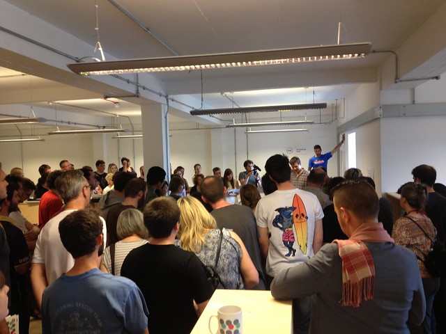
Today I am dipping in and out (around other meetings) of Interactive Scotland@Turing, the conference day of the Turing Festival. It’s being live streamed over on the AmbITion Scotland website.

I have just caught the tail end of “Big data (and doing something with it)” – Dave Coplin, Director of Search and Futurologist, Microsoft. Designing big data, privacy, and security in from the beginning was the big message there. Also that your child’s first search engine query is a moment of huge pride.

Next up is “Information is beautiful – a picture paints a thousand words” – John Loudon, Head of Multimedia, BiP Solutions. He’s basically giving the big picture on infographics and reminding the audience that infographics are hundreds of years old. He’s running through several examples, looking at how effective they are and the power of graphics even if the text is in another language – a great illustration that infographics should make basic sense even before you begin labelling. He’s also reminding us of maps as infographics and innovations such as contour lines.

Infographics shouldn’t just be about clicks, it should be about learning, discovery. It should represent interesting research or data. They need to be engaging. BiP now use infographics for their own corporate management – looking for demand on their helpdesk to plan holidays say. The company produce a magazine for the MoD and decided to start trialling infographics in this. We had the data, then we wanted to know what the key questions are here for readers. Asking those questions to the data made for surprises. After checking and double checking it became clear that those surprises were correct representations of the data – that’s really useful for us and for our readers.

Some key lessons for infographics:

  • Don’t just use templates.
  • Don’t be over complex – use a basic table if that is better.
  • Tell a story, have great content, and make it relevant and right for your audience.
  • Find data to compare and contrast, data on it’s own can be quite boring so you have to draw out the interesting .

What are the benefits of data infographics? Well they should communicate information, they give you an opportunity to inform your audience and, yes, to share and be sociable.


And now… Richard Ayers, CEO, Seven League – “Ambassador, with this datatainment you are really spoiling us”

“I will be talking about how we use infographics in our work which is mainly in the sports and creative industries. I talk about something I call the “Foreign Office Strategy” for social media. The consulate have made decisions about relative merit of having a consulate in a particular area. Some run events, some do huge cultural work, some just stamp passports. Social media is like that – you have to make a decision over the merits of where and how much to engage in each area.

And data can be the same way. But you have to make sure you tell stories with that data and I’m going to talk

Film – BFI. the BFI is really the centre for film in Britain. They have a massic beautiful archive. They don’t just have film. There are 20k unpublished film scripts, cinema ephemera, personal papers, all press photos from Doctor Who. Even kids drawings – although in the modern era these are not kept but destroyed for child safety reasons. Behind the scenes images of Star Wars are in the archive… huge amounts of materials. But only 90,000 films are digitised. But all will be done, and the metadata will be good! But not all of that metadata is known – shooting location etc. That’s a crowdsourcing/wiki opportunity. I’m going to run through some stuff that is coming and welcome more suggestions, especially if they make BFI, a charity, a bit of money. One of the things that’s already in the works are Time Capsule – capturing the nations memories of viewing film; alternative forms of navigation – mind maps that show connections between films, directors etc; we’ve got 100 greats? as well. Now I get sick of that concept but I’m interested in people’s 100 greatest and then overlaying BFI knowledge and undestanding; film tracker – recommends upcoming films and connects to materials in the archive, sight and sound reviews etc. And we haven’t even got to the API for SID (our Systems Information Database) and that will create huge opportunities to change things. So that’s film…

Onto sports… Datatainment is a term I’ve blogged about a lot. I love sport, football isn’t my favourite but I love sport. But there is an increadible level of sports data. This is sprint speeds, jump heights, tackles, etc. There was a campaign for Heinekan – a game, kind of like betting, on particular players. It was ok and interactive but not great. More exciting is the Major League Baseball app which lets you switch between footage, commentary, stats, alternative views, pitch images – really really nice. Imagine if we could do that with cricket? There are so many stats and if you are a fan you want all that! In the modern era at Lords they show scores from Teletext!

Lets talk about LimeLight. They have been backroom guys. Sports England says that engagement in mainstream sport is kind of holding steady but the areas in growth is 5ks, 10ks, triathlon, cycling etc. There is a tremendous involvement in personal sporting activity. I think that’s great. LimeLight organised the road race, time trial, marathons, and triathlon swim. They also run those kinds of the event – with 30-40k participants – all through the year. And there are chips on all of these competitors… the things you can do. There is a tendency to look at participants as individuals but he is also a one-man team – with support structures, there are loads of people supporting these people here. There is a huge opportunity here… LimeLight don’t put on a race for 30k people but a 9 month sports engagement campaign for 110k people.

MyPace is a great app here – it tracks the race and lets you replay dots on the map, picks out routes of winners etc. It uses simple data points here. What’s interesting is that for the race coming up in October we are putting maps and interactive boards and an app so that spectators can know what’s doing on throughout, enabling better engagement and support. The BBC is starting to do datatainment – presenting old school TV over the top. We are seeing line graphs in the Olympics coverage. New to TV but sports analysts have long been hugely into data but it’s never been used to engage and interpolate the sport for the audience. On football and rugby the stats as is really don’t engage anyone but those that already know about the sport. The Olympics have really presented a possibility to make this data accessible. We also saw virtual world record markers on the pool. We also saw Emoto – Twitter sentiment analysis of the Olympics. I’m not a huge fan of sentiment analysis but it gives you an interesting view into what’s happening. The BBC showing relative heights and weights of athletes – and your own place in the scheme of things. And you could download the data table for all athletes…

And that brings me to Open Data. We’ve been doing lots of data work and products that will launch. But in the meantime we’ve been working on Manchester City Performance data – for last year – and making that freely available to play with and that’s groundbreaking.

Perhaps opening up that data will open those sports to those who have not previously engaged with them: we’ll have established the right data and social embassies.”

And with that I leave the livestream for a meeting but will return…

OK, it’s nearly 4pm and I have returned from a series of meetings and lunch to catch the last two hours of the conference…

I’ve dipped in mid-talk about Brewster which aggregates multiple profiles [just been investigating reviews and it appears that Brewster is useful for those in the US but not the UK at present]. Gavin Dutch has just commented that he is most excited by devices combining with the real world. Like tap-a-note – a hacking project for Evernote using a chip that you placed around the house – say on your fridge – and if you tapped that note you’d see alerts associated with that chip/object. Another panel member has been musing over web apps vs cloud apps – a nice poll of the room (full of geeks) indicate that they have trouble understanding just what the cloud is, and what is and is not a cloud app. Finally a panel member says that “hardware is red hot”. And that session (the end of “Put bangers in your mobile mashup”) closes on a prediction of hoverboards…

The folks at Dynamic Earth have headed for coffee so a wee bit of a break for the webstreamers here but up next are:

 ”Fragmentation & the State of Online Video” –  Luke Gaydon, VP Operations EMEA, Brightcove

Luke will be talking about online video from the perspective of Brightcove, a cloud based content services provider. Our best known product is VideoCloud and I’ll be looking at this issue from this perspective. VideoCloud is everything to allow you to manage and distribute video, with around 4500 customers. Some of these customers include big media and non media brands and include EMI, Sky, STV etc. They are responsible for 800-900 million streams going through the VideoCloud platform.

“I wanted to dwell a little bit on some key moments in the history of online video… firstly a fashion show stream taken down by denial of service attack, Steve Jobs, US Elections, iPlayer and NetFlix, Hulu launches – online legal video for free, Obama’s inaugeration speech, launch of Apple TV, the Royal Wedding (2.9 M concurrent streams), Olympics 2012 (hugely outperforms that royal wedding number). This year US viewers will stream more online video than DVD and Blu-Ray combined.

I used to work at Channel 4 and I used to sell Big Brother. We had clips, we put them onto a RealMedia player. It was a simple workflow. But now video is increasingly complicated. You have the video library of short, long, on demand, live video. The libraries increase in size exponentially. Then the places/platforms that publishers want to distribute to: mobile apps and the mobile web, the website, set-top boxes, connected TVs, gaming console, and via Social Media through Facebook etc. Suddenly the workflow is much more complicated. So to put this into context. 100m households in the world own at least one connected TV, huge uptake of broadband and smartphones. But all these devices are different. Whilst we’ve seen video standards like HTML5 and h.264 and that is great but you will never get all device producers to agree.

When Warner Brothers released the Dark Knight they showed it via Facebook. That seemed bizarre to me but my young relatives sit there with Facebook open all day and it made sense to them. That’s just where they hang out online.

The big question around connected TVs is the extent within which people actually use their functionality. Apparently quite a lot of connected TVs don’t actually get connected… except in Germany where an onscreen prompt tells you to connect the TV up to the internet.”

And with that I had a wee interruption but note via Twitter that:

“ vid viewing on social networks grew 40% at end of March 2012 -becoming the home of TV & film views”

Back to the stream:

“I think I wanted to give you a view of where we are at and then share thoughts/musings and key trends we’ve seen developing in the last few years and see developing in the future.

  1. the notion of a “media company” needs reviewing. It’s not just a TV or Film or Publishing firm these days. Increasingly the notion of a traditional media company has been turned on it’s head. I remember Red Bull being a fizzy drink company but Red Bull has a TV channel, they have a commissioning department which commissions content for them. I was talking last night to someone asking if it’s long until Red Bull commission a feature film… apparently they already have! Marks and Spencers are creating content. You can put these sites on TV but you have to login to purchase – and logins via remotes are a nightmare.
  2. The rise of XBox as an entertainment platform, which goes hugely far beyond gaming.
  3. The iPhone and iPad are creating new expectations about how we interact with devices and consume content.
  4. Future of TV experiences. First screen display and consume, second screen for searching, controlling, interacting
  5. Finally… the most important thing is the content!”

“Social Media:  television’s best new friend?” – Anthony Rose, Co-Founder & CTO, Zeebox

“I am going to do some Fringe inspired improv here as my theme is very much storytelling. As a programme maker can you engage with your audience directly and own that engagement rather than selling to a broadcaster, have them manage engagement. Broadcast is not just on TV but also on the web. Back when I headed up BBC iPlayer it was great that folk could watch content anywhere, anytime. But the best I was doing was watching the same TV, albeit time shifted. But how can we think of a new model? There are two takes here?

Well back in the 90s we made real time 3D graphic engine that allowed us to make interactive stories – we licensed content like Xena, Choose your own knightmare, etc. then writers created a story you could choose your own ending. It’s maybe like what can be done with sports views. When we started we had fairly grotty looking graphics but they improved. But the scriptwriters and storywriters had real issues. But it seems to be a left brain/right brain thing. Developers think brilliantly about logic but struggle with storytellers. I wanted storytellers to think about logic but it was super difficult. How do you bring interactivity to a medium we know and love well.

The other aspect is Microsoft’s foray into the TV space. In the 90s Microsoft were trying to sell an NT based TV platform. They made a video of the house of the future – everything had a screen – like the fridge and the toaster – and you could touch the screen and agree or disagree. They built a house of the future with these flatscreen TVs – but it was the exact same picture. Ten years of the finest minds hadn’t moved on. There is a really big challenge here to think ahead. The cost is great – an interactive TV is expensive for the future. And for the broadcaster to work for the small number of their huge audience who can interact is expensive and tricky. But the phone and ipad are bringing something in here, interactivity through a second screen. And I think the future is on-demand tv with syncronous experiences.

Sky brought 10% of company recently. We have a great product. Imagine you are sitting in front of your TV – you have your phone or tablet with you. You will never be without it one day! A few problems to solve with TV. You have to decide what to watch and you want a trusted authority to help you discover what’s on. And social comes in there soon. Zuckerberg reckons it’s your friends, Amazon would say that the recommendation engine will tell you, BBC or Guardian would say trusted authority. But wouldn’t it be great to have info delivered to your smartphone and tablets. These bring in interactions, transactional experience. Advertisers spend millions trying to sell you things but it’s a convoluted path, a one click experience works well.

Zeebox ingest live TV in the UK, we use speech analysis and the subtitles of that TV and extract meaning second by second. Our servers look for meaningful information – names, type of advert, etc. Wouldn’t it be great to see what is coming up soon? Well that’s the start screen for Zeebox in our newest version – brings in tweets etc. Can also see featured aspects – what celebrities are watching, your friends, what is being seen on Freeview if that is what you are using, what else is being watched on Sky if you use that etc. And you get privacy options there. Or you can just use EPG that includes friends and what they are watching. Zeebox can also just act as a remote control with a range of TV devices.

Zeebox can also be the next generation of “The Bar” – the Neilson panel of 1000 viewers. Real time analytics changes how TV can be monitored and understood.

Once upon a time you had to watch TV when it was being broadcast. Now you can time shift. But you will also be able to watch with others – create viewing partners. And you can also watch with celebrities based upon what they are sharing at that time. And you can see new conversations, links, self-generating tags etc. Everything becomes clickable. You can also look via Amazon. This is the beginning. Advertisers may buy a broad ad on TV and start to use second screens to personalise that. That really disrupts the model of advertising. Advertisers could buy a word on TV – you could show the ad whenever a word arises and you click for more info! It’s a bit like old iPlayer days… it’s about bringing interactivity into the programme.

We have a platform – OpenBox – to enable that one framework for multiple programmes. And that will open up to Developers via an API at some point.  That’s based on HTML5. For example we did this for Eurovision – and could poll each entry, we could link to their albums for sale etc. For Sky we did Got To Dance where alternative commentaries were made available via presenters using Zeebox on iPad. Football is another great example here. An interactive way to monitor progress, find more info, and this was sponsored so also a way to generate income.

Finally this is all about analytics… broadcast isn’t stats rich but platforms allow a huge amount of data to be gathered, used, and understood. Data is the new oil.

A programme maker can’t be totally interactive with the audience yet but you can create programmes with interactivity built in, or build rich interactivity around a traditional programme. Second screen propositions are valuable, disruptive and leading to enormous innovation. If you are creating content, if you are a games developer or programmer think about what could be done here. I think this will lead to the fastest pace of change in TV in decades.”

“Second Screen – the new remote control” – Gareth Capon, Product Development Director, BSkyB

“I wanted to talk about second screen – or screens  – in a rather different context. Luke gave a great sense of the growth of connected devices. Our view of where the market is – dominated by smart phones and game devices. When we look to 2015 we expect huge growth in connected devices. But not all will be connected immediately – we need to make sure customers do actually see the value in connecting, to show experiences that make this worthwhile. We’ve also talked about networks today. At least 15% of the UK are connected for fibre, particularly in larger metro areas. By 2015 we think there will be 75% of UK on up to 24MBps – that is an important change for us and will change how consumers interact with our products. In terms of mobile we expect three times more mobile connectivity by 2015, and five times more wifi hotspots – and many will be free. We are building out The Cloud wifi service as a free service for customers. As consumers we have options. We can give more choice and also control the service from end to end and improve the service as a result. In terms of mobile… 4.3 million downloads of Sky content on smartphones in 2011, 25 million in 2012. It’s increadibly important for us as a platform.

So now a day in the life of the iPad… I read that more people use their phones as an alarm clock than as a phone now! We can prepare ourselves for the day.. .it could be current news but actually lots of our experiences don’t fit with our day. Lets look at Formula 1 – they are international and not always at convenient times of day. For that we’ve made an iPad app for F1 with 9 live feeds and information not on the TV feed…”

And I’m afraid I got called away but I’m back to continue noting the panel session…

“Engaging the Audience – Shaping the future for our connected world” – Panel Chair : Mike Dicks, Senior Policy Executive, PACT with Luke Gaydon, Brightcove; Anthony Rose, Zeebox; Gareth Capon, BSkyB; Alistair Brown, CTO, STV Group; Dave Coplin, Microsoft.

Mick Dicks: “There is another festival in Edinburgh this weekend – most of my colleagues are over at the Edinburgh TV Festival at the moment which is obviously very connected to this session”.  Last year we had Eric Schmidt in Edinburgh and he said “ignore the internet at your peril” and in her McTaggart this year Elizabeth Murdoch said “ignore the digital native at your peril”…

My first question is we have distribution, broadcasters, platforms, investors, userpers, disruptors… who is going to control the relationship with the audience? And who pays for the content?

Alastair Brown, STV: I think we’re seeing some interesting things. Apple talking to cable operators. Second stream experiences will be driven off linear viewing for the forseeable future but an interesting few years.

Dave Coplin, Microsoft: we always knew that our consumers used XBox for other things but we saw a stat a few years back that said users were spending 40% of their XBox time not playing games which really emphasised the impact of that. Families are needing to negotiate which platform to access content in.

Anthony Rose, Zeebox: This stuff will get more confusing for the average family. TV manufacturers want to control the user experience, want to take you to apps, to make money. EPGs might be a paid for thing… BBC won’t be top of list. Think of a broadcaster as content provider, distributor (via TV/Freeview/etc. bandwidth), and a destination site. And broadcasters have to think about how to do all three or whether to do all three. When I was on iPlayer it was problematic as iPlayer could be great if you were working in digital teams etc. but a bad thing for BBC Vision, who control the channels. And programme makers saw it as good but perhaps greater viewers if they could just share direct to YouTube… it’s never straightforward.

Luke Gaydon, BrightCove: There will be a lot more change. I love the idea that everyone comes together and collaborates to build amazing user experiences I think it’s unlikely. The problem but also opportunity for the broadcasters is that they have the history of content production and commissioning. The lineage broadcasters have is a huge asset.

Mike Dicks, PACT: What does this audience do rather than a TV audience do to enable interactions with the audience? Where do developers come to you with ideas around programming, content, etc?

Alastair Brown, STV: we are hiring and looking for partners, ideas etc. Things like YouView, ZeeBox etc. help you get thinking. You could expose all sorts of added value content.

Dave Coplin, Microsoft: XBox smart glass – lets new types of interactions take place. Developers have to think about what platform to support.

Luke Gaydon, BrightCove: That choice of platforms is also a big opportunity though. From my Channel 4 days it was really rare to find people in commissioning who really got interactive content. My understanding is that there is a lot more cross-platform commissioning now though so the broadcasters are listening more now.

Mick Dicks, PACT: What are threats rather than opportunities.

Gareth Capon, BSkyB: we are geeks, we can get totally over excited but it’s all still really early, there are no rules yet… most people are watching regular TV right now but we can do huge new things.

Dave Coplin, Microsoft: I love that Man City approach we saw early, the fans are the best people to build stuff with that data. Normal people are geeks too, anyone can code. Content providers will be rewarded if they open up their content to those that love it.

Questions:

Q: Darcie Tanner, LBi: Right now everything is using social and logins are tied to one person but that gets messy on devices… what about the household logins or people using each others logins, shared devices, is anyone thinking about merging, recommendations etc.

Mick Dicks, PACT: that’s the amazon recommendations issue as well.. is that a second screen thing?

Gareth Capon, BSkyB: that’s  totally important. It’s not about I it’s about we here… context is all. We have to cope with that as a business. We have to be able to react to a change in context. Recommendations have so far to go…

Anthony Rose, Zeebox: We do need to think about how to prioritise things here… the fringe is a good parallel again. We need to really create new watercooler moments, we need to raise awareness of small programmes etc…

Dave Coplin, Microsoft: this is about the issue of paying separately right? (to Darcie) you had two Netflix accounts?

Darcie: Yeah, there is no way to merge them, even if you paid for a more expensive subscription you have to pick one account – and lose data from the others, you can’t merge. I did contact NetFlix and suggested merging… I think they are missing a trick…

Dave Coplin, Microsoft:  we do have household XBox deals there, Sky does this to an extent to but yes, more opportunity there…

Q: Aaron Quigley, St Andrews University: I’ve been working with multiple screens, eye tracking together etc. and there are huge things you can do there but media doesn’t seem to be adopting these technologies…

Dave Coplin, Microsoft:  This is where the XBox Smart Glass comes in really…

Discussion: but this is also an issue of who owns experience vs. who creates content and hardware…

Q: Apparently the experience of football is better at home and ticket sales have been going down… Video killed the radio star – so what will the second screen kill ?

Discussion: that’s about making things better – whether in the in-person experience or at home. Music composers used to make money selling sheet music and feared performance sales… we should think about changing technology, not good nor bad but just changing.

Mick Dicks, PACT: TV is finding live events are huge for advertising…

Alastair Brown, STV: absolutely. Live football or X Factor finals get huge engagement. Different content gets different levels of engagement.

Mick Dicks, PACT: What will happen two years down the line?

Alastair Brown, STV: We are moving to a new phase as a digital company now…

Dave Coplin, Microsoft:  SmartGlass will be on iOS and Android and that’s huge for us… that’s a time of huge change. We should do more of that..

Gareth Capon, BSkyB:  I didn’t talk about NowTV – our new internet delivery business. With that model we can take services and a whole range of business models, types of consumption, formats etc. to anyone in the UK as they want it.

Anthony Rose, Zeebox: we like to release something new each month… that will be 20 versions between now and two years time so hard to know where we’ll be. But we’re different to large broadcasters who know where they will be. We don’t know and can base our change on feedback and experience. We will move from being disruptive and instead partner, find new niches, etc. That will morph enormously over coming months for this new space.

Luke Gaydon, BrightCove: We will be everything, we’ll be the defacto digital distributor of video, we’ll buy Google!

And on that playful note that’s me finishing my slightly patchy live blogging of an interesting virtual Turing day. Off to enjoy a weekend in the very real, almost sunny Edinburgh for me.

DeliciousShare/Bookmark

A quietly amplified summer

You may be wondering what I’ve been up to for the last few months as things have been rather quiet here on the blog. I thought it was time to post something brief on recent activities ahead of a longer post to come soon…

June saw the Digimap GeoForum in York and I was in full social media amplification mode liveblogging, tweeting and shooting a timelapse of the event. Read through the whole event here on the Digimap blog.

Click here to view the embedded video.

My book chapter on “Support for users within an educational or e-learning context” in the volume ”User Studies for Digital Library Development” (Editors Milena Dobreva, Andy O’Dwyer and Pierluigi Feliciati) was also published in late June. Click through to the Facet site or on Amazon to secure your copy!

There was a brief excursion to London for one of the Guardian Seminars on Social Media from Jennifer Begg – I would recommend these particularly to those who have been using social media for a while but are not yet tackling it strategically.  Jennifer even managed to introduce me to an excellent web app that I’d never heard of: Bufferapp is a fantastic webapp and Chrome plugin that enables you to queue up tweets in advance – a more reliable alternative to FutureTweets or a cheaper and more user-friendly alternative to HootSuite. In exchange I shared my adoration of If This Then That (which has recently added some really useful new channels and options around sharing “recipes” for tasks) which inspired a blogpost from Jennifer that’s well worth a read if you want to get started with IFTTT.

And so to July…

This month I have mainly been preparing, with help from my fantastic student Zack, for the Open Repositories 2012 Conference. This is an international event and this year it attracted over 460 delegates from 34 countries. I was part of the Host Organising Committee and led the amplification of the event via videoing sessions, liveblogging, tweets, photography, managing a Flickr group and a conference CrowdVine presence, use of tools like Pinterest etc. It was a fantastic experience of social media amplification at huge scale – we had over 4000 tweets to the conference hashtag during the event for instance – and I’m just now working out what to analyse further, write up, reflect upon, etc. Look out for a fuller blogpost soon. In the meantime you can explore the Open Repositories 2012 website to find all of the content created thus far.

And now? Well in addition to all the day to day EDINA social media stuff I am preparing my module on Social Media for the forthcoming MSc in Science Communication and Public Engagement – there are still spaces left so do take a look at the website and consider applying for what will be a fantastic masters programme!

And finally… I have also been completing my MSc in eLearning Dissertation on CPD in Collaborative Social Media Spaces. Once submitted I will share a copy here as many of you were kind enough to complete my research questionnaire some months back.


DeliciousShare/Bookmark