
We are very pleased to announce that we we recently added WMS (Web Map Service) functionality to all Digimap Roam applications. This new facility allows you to pull in map data from a whole host of publicly accessible services allowing you to visualise a wealth of data in the familiar Digimap Roam interface. This is […]
Category Archives: Open Data
eLearning@ed/LTW Monthly Showcase #2: Open
Today we have our second eLearning@ed/LTW Showcase and Network event. I’m liveblogging so, as usual, corrections and updates are welcome.Â
Jo Spiller is welcoming us along and introducing our first speaker…
Dr. Chris Harlow – “Using WordPress and Wikipedia in Undergraduate Medical & Honours Teaching: Creating outward facing OERs”
I’m just going to briefly tell you about some novel ways of teaching medical students and undergraduate biomedical students using WordPress and platforms like Wikipedia. So I will be talking about our use of WordPress websites in the MBChB curriculum. Then I’ll tell you about how we’ve used the same model in Reproductive Biology Honours. And then how we are using Wikipedia in Reproductive Biology courses.
We use WordPress websites in the MBChB curriculum during Year 2 student selected components. Students work in groups of 6 to 9 with a facilitator. They work with a provided WordPress template – the idea being that the focus is on the content rather than the look and feel. In the first semester the topics are chosen by the group’s facilitator. In semestor two the topics and facilitators are selected by the students.
So, looking at example websites you can see that the students have created rich websites, with content, appendices. It’s all produced online, marked online and assessed online. And once that has happened the sites are made available on the web as open educational resources that anyone can explore and use here:Â http://studentblogs.med.ed.ac.uk/
The students don’t have any problem at all building these websites and they create these wonderful resources that others can use.
In terms of assessing these resources there is a 50% group mark on the website by an independent marker, a 25% group mark on the website from a facilitator, and (at the students request) a 25% individual mark on student performance and contribution which is also given by the facilitator.
In terms of how we have used this model with Reproductive Biology Honours it is a similar idea. We have 4-6 students per group. This work counts for 30% of their Semester 1 course “Reproductive Systems” marks, and assessment is along the same lines as the MBChB. Again, we can view examples here (e.g. “The Quest for Artificial Gametes”. Worth noting that there is a maximum word count of 6000 words (excluding Appendices).
So, now onto the Wikipedia idea. This was something which Mark Wetton encouraged me to do. Students are often told not to use or rely on Wikipedia but, speaking a biomedical scientist, I use it all the time. You have to use it judiciously but it can be an invaluable tool for engaging with unfamiliar terminology or concepts.
The context for the Wikipedia work is that we have 29 Reproductive Biology Honours stduents (50% Biomedical Sciences, 50% intercalculating medics), and they are split into groups of 4-5 students/groups. We did this in Semester 1, week 1, as part of the core “Research Skills in Reproductive Biology”. And we benefited from expert staff including two Wikipedians in Residence (at different Scottish organisations), a librarian, and a learning, teaching and web colleague.
So the students had an introdution to Wikipedia, then some literature searching examples. We went on to groupwprl sesssions to find papers on particular topics, looking for differences in definitions, spellings, terminology. We discussed findings. This led onto groupwork where each group defined their own aspect to research. And from there they looked to create Wikipedia edits/pages.
The groups really valued trying out different library resources and search engines, and seeing the varying content that was returned by them.
The students then, in the following week, developed their Wikipedia editing skills so that they could combine their work into a new page for Neuroangiogenesis. Getting that online in an afternoon was increadibly exciting. And actually that page was high in the search rankings immediately. Looking at the traffic statistics that page seemed to be getting 3 hits per day – a lot more reads than the papers I’ve published!
So, we will run the exercise again with our new students. I’ve already identified some terms which are not already out there on Wikipedia. This time we’ll be looking to add to or improve High Grade Serious Carcinoma, and Fetal Programming. But we have further terms that need more work.
Q&A
Q1) Did anyone edit the page after the students were finished?
A1) A number of small corrections and one querying of whether a PhD thesis was a suitable reference – whether a primary or secondary reference. What needs done more than anything else is building more links into that page from other pages.
Q2) With the WordPress blogs you presumably want some QA as these are becoming OERs. What would happen if a project got, say, a low C.
A2) Happily that hasn’t happened yet. That would be down to the tutor I think… But I think people would be quite forgiving of undergraduate work, which it is clearly presented at.
Q3) Did you consider peer marking?
A3) An interesting question. Students are concerned that there are peers in their groups who do not contribute equally, or let peers carry them.
Comment) There is a tool called PeerAim where peer input weights the marks of students.
Q3) Do all of those blog projects have the same model? I’m sure I saw something on peer marking?
A3) There is peer feedback but not peer marking at present.
Dr. Anouk Lang – “Structuring Data in the Humanities Classroom: Mapping literary texts using open geodata”
I am a digital humanities scholar in the school of Languages and Linguistics. One of the courses I teach is digital humanities for literature, which is a lovely class and I’m going to talk about projects in that course.
I am a digital humanities scholar in the school of Languages and Linguistics. One of the courses I teach is digital humanities for literature, which is a lovely class and I’m going to talk about projects in that course.
The first MSc project the students looked at was to explore Robert Louis Stevenson’s The Dynamiter. Although we were mapping the texts but the key aim was to understand who wrote what part of the text.
So the reason we use mapping in this course is because these are brilliant analytical students but they are not used to working with structured data, and this is an opportunity to do this. So, using CartoDB – a brilliant tool that will draw data from Google Sheets – they needed to identify locations in the text but I also asked students to give texts an “emotion rating”. That is a rating of intensity of emotion based on the work of Ian Gregory – spatial historian who has worked with Lakes data on the emotional intensity of these texts.
So, the students build this database by hand. And then loaded into CartoDB you get all sorts of nice ways to visualise the data. So, looking at a map of London you can see where the story occurs. The Dynamiter is a very weird text with a central story in London but side stories about the planting of bombs, which is kind of played as comedy. The view I’m showing here is a heatmap. So for this text you can see the scope of the text. Robert Louis Stevenson was British, but his wife was American, and you see that this book brings in American references, including unexpected places like Utah.
So, within CartoDB you can try different ways to display your data. You can view a “Torque Map” that shows chronology of mentions – for this text, which is a short story, that isn’t the most helpful perhaps.
Now we do get issues of anachronisms. OpenStreetMap – on which CartoDB is based – is a contemporary map and the geography and locations on the map changes over time. And so another open data source was hugely useful in this project. Over at the National Library of Scotland there is a wonderful maps librarian called Chris Fleet who has made huge numbers of historical maps available not only as scanned images but as map tiles through a Historical Open Maps API, so you can zoom into detailed historical maps. That means that mapping a text from, say, the late 19th Century, it’s incredibly useful to view a contemporaneous map with the text.
You can view the Robert Louis Stevenson map here: http://edin.ac/20ooW0s.
So, moving to this year’s project… We have been looking at Jean Rhys. Rhys was a white Creole born in the Dominican Republic who lived mainly in Europe. She is a really located author with place important to her work. For this project, rather than hand coding texts, I used the wonderful wonderful Edinburgh Geoparser (https://www.ltg.ed.ac.uk/software/geoparser/??) – a tool I recommend and a new version is imminent from Clare Grover and colleagues in LTG, Informatics.
So, the Geoparser goes through the text and picks out text that looks like places, then tells you which it things is the most likely location for that place – based on aspects like nearby words in the text etc. That produces XML and Clare has created me an XSLT Stylesheet, so all the students have had to do is to manually clean up that data. The GeoParser gives you GeoNames reference that enables you to check latitude and longitude. Now this sort of data cleaning, the concept of gazeteers, these are bread and butter tools of the digital humanities. These are tools which are very unfamiliar to many of us working in the humanities. This is open, shared, and the opposite of the scholar secretly working in the librarian.
We do websites in class to benefit from that publicness – and the meaning of public scholarship. When students are doing work in public they really rise to the challenge. They know it will connect to their real world identities. I insist students sow their name, their information, their image because this is part of their digital scholarly identities. I want people who Google them to find this lovely site with it’s scholarship.
So, for our Jean Rhys work I will show you a mock up preview of our data. One of the great things about visualising your data in these ways is that you can spot errors in your data. So, for instance, checking a point in Canada we see that the Geoparser has picked Halifax Nova Scotia when the text indicates Halifax in England. When I raised this issue in class today the student got a wee bit embarrassed and made immediate changes… Which again is kind of perk of work in public.
Next week my students will be trying out QGIS Â with Tom Armitage of EDINA, that’s a full on GIS system so that will be really exciting.
For me there are real pedagogical benefits of these tools. Students have to really think hard about structuring their data, which is really important. As humanists we have to put our data in our work into computational form. Taking this kind of class means they are more questioning of data, of what it means, of what accuracy is. They are critically engaged with data and they are prepared to collaborate in a gentle kind of way. They also get to think about place in a literary sense, in a way they haven’t before.
We like to think that we have it all figured out in terms of understanding place in literature. But when you put a text into a spreadsheet you really have to understand what is being said about place in a whole different way than a close reading. So, if you take a sentence like: “He found them a hotel in Rue Lamartine, near Gard du Nord, in Monmatre”. Is that one location or three? The Edinburgh GeoParser maps two points but not Rue Lamartine… So you have to use Google maps for that… And is the accuracy correct. And you have to discuss if those two map points are distorting. The discussion there is more rich than any other discussion you would have around close reading. We are so confident about close readings… We assume it as a research method… This is a different way to close read… To shoe horn into a different structure.
So, I really like Michel De Certeau’s “Spatial stories” in The practice of everyday life (De Certeau 1984), where he talks about structured space and the ambiguous realities of use and engagement in that space. And that’s what that Rue LaMartine type example is all about.
Q&A
Q1) What about looking at distance between points, how length of discussion varies in comparison to real distance
A1) That’s an interesting thing. And that CartoDB Torque display is crude but exciting to me – a great way to explore that sort of question.
OER as Assessment – Stuart Nichol, LTW
I’m going to be talking about OER as Assessment from a students perspective. I study part time on the MSc in Digital Education and a few years ago I took a module called Digital Futures for Learning, a course co-created by participants and where assessment is built around developing an Open Educational Resource. The purpose is to “facilitate learning for the whole group”. This requires a pedagogical approach (to running the module) which is quite structured to enable that flexibility.
So, for this course, the assessment structure is 30% position paper (basis of content for the OER), then 40% of mark for the OER (30%peer-assessed and tutor moderated / 10% self assessed), and then the final 30% of the marks come from an analysis paper that reflects on the peer assessment. You could then resubmit the OER along with that paper reflecting on that process.
I took this module a few years ago, before the University’s adoption of an open educational resource policy, but I was really interested in this. So I ended up building a course on Open Accrediation, and Open Badges, using weebly: http://openaccreditation.weebly.com/.
This was really useful as a route to learn about Open Educational Resources generally but that artefact has also become part of my professional portfolio now. It’s a really different type of assignment and experience. And, looking at my stats from this site I can see it is still in use, still getting hits. And Hamish (Macleod) points to that course in his Game Based Learning module now. My contact information is on that site and I get tweets and feedback about the resource which is great. It is such a different experience to the traditional essay type idea. And, as a learning technologist, this was quite an authentic experience. The course structure and process felt like professional practice.
This type of process, and use of open assessment, is in use elsewhere. In Geosciences there are undergraduate students working with local schools and preparing open educational resources around that. There are other courses too. We support that with advice on copyright and licensing. There are also real opportunities for this in the SLICCs (Student Led Individually Created Courses). If you are considering going down this route then there is support at the University from the IS OER Service – we have a workshop at KB on 3rd March. We also have the new Open.Ed website, about Open Educational Resources which has information on workshops, guidance, and showcases of University work as well as blogs from practitioners. And we now have an approved OER policy for learning and teaching.
In that new OER Policy and how that relates to assessment, and we are clear that OERs are created by both staff and students.
And finally, fresh from the ILW Editathon this week, Ewan MacAndrew, our new Wikimedian in residence, will introduce us to Histropedia (Interactive timelines for Wikipedia:Â http://histropedia.com) and run through a practical introduction to Wikipedia editing.
Leading a Digital Curation ‘Lifestyle’: First day reflections on IDCC15
[First published on the DCC Blog, republished here with permission.]
Okay that title is a joke, but an apt one to name a brief reflection of this year’s International Digital Curation Conference in London this week, with the theme of looking ten years back and ten years forward since the UK Digital Curation Centre was founded.
The joke references an alleged written or spoken mistake someone made in referring to the Digital Curation lifecycle model, gleefully repeated on the conference tweetstream (#idcc15). The model itself, as with all great reference works, both builds on prior work and was a product of its time – helping to add to the DCC’s authority within and beyond the UK where people were casting about for common language and understanding in this new terrain of digital preservation, data curation, and – a perplexing combination of terms which perhaps still hasn’t quite taken off, ‘digital curation’ (at least not to the same extent as ‘research data management’). I still have my mouse-mat of the model and live with regrets it was never made into a frisbee.

They say about Woodstock that ‘if you remember it you weren’t really there’, so I don’t feel too bad that it took Tony Hey’s coherent opening plenary talk to remind me of where we started way back in 2004 when a small band under the directorship of Peter Burnhill (services) and Peter Buneman (research) set up the DCC with generous funding from Jisc and EPSRC. Former director Chris Rusbridge likes to talk about ‘standing on the shoulders of giants’ when describing long-term preservation, and Tony reminded us of the important, immediate predecessors of the UK e-Science Programme and the ground-breaking government investment in the Australian National Data Service (ANDS) that was already changing a lot of people’s lifestyles, behaviours and outlooks.
Traditionally the conference has a unique format that focuses on invited panels and talks on the first day, with peer-reviewed research and practice papers on the second, interspersed with demos and posters of cutting edge projects, followed by workshops in the same week. So whilst I always welcome the erudite words of the first day’s contributors, at times there can be a sense of, ‘Wait – haven’t things moved on from there already?’ So it was with the protracted focus on academic libraries and the rallying cries of the need for them to rise to the ‘new’ challenges during the first panel session chaired by Edinburgh’s Geoffrey Boulton, focused ostensibly on international comparisons. Librarians – making up only part of the diverse audience – were asking each other during the break and on twitter, isn’t that exactly what they have been doing in recent years, since for example, the NSF requirements in the States and the RCUK and especially EPSRC rules in the UK, for data management planning and data sharing? Certainly the education and skills of data curators as taught in iSchools (formerly Library Schools) has been a mainstay of IDCC topics in recent years, this one being no exception.
But has anything really changed significantly, either in libraries or more importantly across academia since digital curation entered the namespace a decade ago? This was the focus of a panel led by the proudly impatient Carly Strasser, who has no time for ‘slow’ culture change, and provocatively assumes ‘we’ must be doing something wrong. She may be right, but the panel was divided. Tim DiLauro observed that some disciplines are going fast and some are going slow – depending on whether technology is helping them get the business of research done. And even within disciplines there are vast differences –-perhaps proving the adage that ‘the future is here, it’s just not distributed yet’.
Geoffrey Bilder spoke of tipping points by looking at how recently DOIs (Digital Object Identifiers, used in journal publishing) meant nothing to researchers and how they have since caught on like wildfire. He also pointed blame at the funding system which focuses on short-term projects and forces researchers to disguise their research bids as infrastructure bids – something they rightly don’t care that much about in itself. My own view is that we’re lacking a killer app, probably because it’s not easy to make sustainable and robust digital curation activity affordable and time-rewarding, never mind profitable. (Tim almost said this with his comparison of smartphone adoption). Only time will tell if one of the conference sponsors proves me wrong with its preservation product for institutions, Rosetta.
It took long-time friend of the DCC Clifford Lynch to remind us in the closing summary (day 1) of exactly where it was we wanted to get to, a world of useful, accessible and reproducible research that is efficiently solving humanity’s problems (not his words). Echoing Carly’s question, he admitted bafflement that big changes in scholarly communication always seem to be another five years away, deducing that perhaps the changes won’t be coming from the publishers after all. As ever, he shone a light on sticking points, such as the orthogonal push for human subject data protection, calling for ‘nuanced conversations at scale’ to resolve issues of data availability and access to such datasets.
Perhaps the UK and Scotland in particular are ahead in driving such conversations forward; researchers at the University of Edinburgh co-authored a report two years ago for the government on “Public Acceptability of Data Sharing Between the Public, Private and Third Sectors for Research Purposes,� as a pre-cursor to innovations in providing researchers with secure access to individual National Health Service records linked to other forms of administrative data when informed consent is not possible to achieve.
Given the weight of this societal and moral barrier to data sharing, and the spread of topics over the last 10 years of conferences, I quite agree with Laurence Horton, one of the panelists, who said that the DCC should give a particular focus to the Social Sciences at next year’s conference.
Robin Rice
Data Librarian (and former Project Coordinator, DCC)
University of Edinburgh
![]()
Open up! On the scientific and public benefits of data sharing
Research published a year ago in the journal Current Biology found that 80 percent of original scientific data obtained through publicly-funded research is lost within two decades of publication. The study, based on 516 random journal articles which purported to make associated data available, found the odds of finding the original data for these papers fell by 17 percent every year after publication, and concluded that “Policies mandating data archiving at publication are clearly needed� (http://dx.doi.org/10.1016/j.cub.2013.11.014).
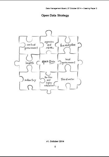
In this post I’ll touch on three different initiatives aimed at strengthening policies requiring publicly funded data – whether produced by government or academics – to be made open. First, a report published last month by the Research Data Alliance Europe, “The Data Harvest: How sharing research data can yield knowledge, jobs and growth.� Second, a report by an EU-funded research project called RECODE on “Policy Recommendations for Open Access to Research Data�, released last week at their conference in Athens. Third, the upcoming publication of Scotland’s Open Data Strategy, pre-released to attendees of an Open Data and PSI Directive Awareness Raising Workshop Monday in Edinburgh.
Experienced so close together in time (having read the data harvest report on the plane back from Athens in between the two meetings), these discrete recommendations, policies and reports are making me just about believe that 2015 will lead not only to a new world of interactions in which much more research becomes a collaborative and integrative endeavour, playing out the idea of ‘Science 2.0’ or ‘Open Science’, and even that the long-promised ‘knowledge economy’ is actually coalescing, based on new products and services derived from the wealth of (open) data being created and made available.
‘The initial investment is scientific, but the ultimate return is economic and social’
John Wood, currently the Co-Chair of the global Research Data Alliance (RDA) as well as Chair of RDA-Europe, set out the case in his introduction to the Data Harvest report, and from the podium at the RECODE conference, that the new European commissioners and parliamentarians must first of all, not get in the way, and second, almost literally ‘plan the harvest’ for the economic benefits that the significant public investments in data, research and technical infrastructure are bringing.
 The report’s irrepressible argument goes, “Just as the World Wide Web, with all its associated technologies and communications standards, evolved from a scientific network to an economic powerhouse, so we believe the storing, sharing and re-use of scientific data on a massive scale will stimulate great new sources of wealth.â€� The analogy is certainly helped by the fact that the WWW was invented at a research institute (CERN), by a researcher, for researchers. The web – connecting 2 billion people, according to a McKinsey 2011 report, contributed more to GDP globally than energy or agriculture. The report doesn’t shy away from reminding us and the politicians it targets, that it is the USA rather than Europe that has grabbed the lion’s share of economic benefit– via Internet giants Google, Amazon, eBay, etc. – from the invention of the Web and that we would be foolish to let this happen again.
This may be a ruse to convince politicians to continue to pour investment into research and data infrastructure, but if so it is a compelling one. Still, the purpose of the RDA, with its 3,000 members from 96 countries is to further global scientific data sharing, not economies. The report documents what it considers to be a step-change in the nature of scientific endeavour, in discipline after discipline. The report – which is the successor to the 2010 report also chaired by Wood, “Riding the Wave: How Europe can gain from the rising tide of scientific data,” celebrates rather than fears the well-documented data deluge, stating,
“But when data volumes rise so high, something strange and marvellous happens: the nature of science changes.�
The report gives examples of successful European collaborative data projects, mainly but not exclusively in the sciences, such as the following:
- Lifewatch – monitors Europe’s wetlands, providing a single point to collect information on migratory birds. Datasets created help to assess the impact of climate change and agricultural practices on biodiversity
- Pharmacog – partnership of academic institutions and pharmaceutical companies to find promising compounds for Alzheimer’s research to avoid expensive late-stage failures of drugs in development.
- Human Brain Project – multidisciplinary initiative to collect and store data in a standardised and systematic way to facilitate modelling.
- Clarin – integrating archival information from across Europe to make it discoverable and usable through a single portal regardless of language.
The benefits of open data, the report claims, extends to three main groups:
- to citizens, who will benefit indirectly from new products and services and also be empowered to participate in civic society and scientific endeavour (e.g. citizen science);
- to entrepeneurs, who can innovate based on new information that no one organisation has the money or expertise to exploit alone;
- to researchers, for whom the free exchange of data will open up new research and career opportunities, allow crossing of boundaries of disciplines, institutions, countries, and languages, and whose status in society will be enhanced.
‘Open by Default’
If the data harvest report lays out the argument for funding open data and open science, the RECODE policy recommendations focus on what the stakeholders can do to make it a reality. The project is fundamentally a research project which has been producing outputs such as disciplinary case studies in physics, health, bioengineering, environment and archaeology. The researchers have examined what they consider to be four grand challenges for data sharing.
- Stakeholder values and ecosystems: the road towards open access is not perceived in the same way by those funding, creating, disseminating, curating and using data.
- Legal and ethical concerns: unintended secondary uses, misappropriation and commercialization of research data, unequal distribution of scientific results and impacts on academic freedom.
- Infrastructure and technology challenges: heterogeneity and interoperability; accessibility and discoverability; preservation and curation; quality and assessibility; security.
- Institutional challenges: financial support, evaluating and maintaining the quality, value and trustworthiness of research data, training and awareness-raising on opportunities and limitations of open data.
 RECODE gives overarching recommendations as well as stake-holder specific ones, a ‘practical guide for developing policies’ with checklist for the four major stakeholder groups: funders, data managers, research institutions and publishers.
‘Open Changes Everything’
The Scottish government event was a pre-release of the open data strategy, which is awaiting final ministerial approval, though in its final draft, following public consultation. The speakers made it clear that Scotland wants to be a leader in this area and drive culture change to achieve it. The policy is driven in part by the G8 countries’ “Open Data Charterâ€� to act by the end of 2015 on a set of five basic principles – for instance, that public data should be open to all “by defaultâ€� rather than only in special cases, and supported by UK initiatives such as the government-funded Open Data Institute and the grassroots Open Knowledge Foundation.
Improved governance (or public services) and ‘unleashing’ innovation in the economy are the two main themes of both the G8 charter and the Scotland strategy. The fact was not lost on the bureaucrats devising the strategy that public sector organisations have as much to gain as the public and businesses from better availability of government data.
The thorny issue of personal data is not overlooked in the strategy, and a number of important strides have been taken in Scotland by government and (University of Edinburgh) academics recently on both understanding the public’s attitudes, and devising governance strategies for important uses of personal data such as linking patient records with other government records for research.
According to Jane Morgan from the Digital Public Services Division of the Scottish Government, the goal is for citizens to feel ownership of their own data, while opening up “trustworthy uses of data for public benefit.�
Tabitha Stringer, whose title might be properly translated as ‘policy wonk’ for open data, reiterated the three main reason for the government to embrace open data:
- Transparency, accountability, supporting civic engagement
- Designing and delivering public services (and increasingly digital services)
- Basis for nnovation, supporting the economy via growth of products & services
‘Digital first’
The remainder of the day focused on the new EU Public Service Information directive and how it is being ‘transposed’ into UK legislation to be completed this year. In short, the Freedom of Information and other legislation is being built upon to require not just publication schemes but also asset lists with particular titles by government agencies. The effect of which, and the reason for the awareness raising workshop is that every government agency is to become a data publisher, and must learn how to manage their data not just for their own use but for public ‘re-users’. Also, for the first time academic libraries and other ‘cultural organisations’ are to be included in the rules, where there is a ‘public task’ in their mission.
‘Digital first’ refers to the charging rules in which only marginal costs (not full recovery) may be passed on, and where information is digital the marginal cost is expected to be zero, so that the vast majority of data will be made freely available.
 Robin Rice
EDINA and Data Library
![]()
FOSS4G – a developers review part 2

Photo – Addy Pope
This is the second part of EDINA’s developer review of FOSS4G 2013. This time it is Mike Gale who will be providing his opinion on what was presented.
Who are you:
Michael Gale – GIS Engineer / Member of the EDINA’s Data Team. My job is to essentially deal with the vast quantities of GIS data we utilise at EDINA. I translate, modify, split and twist the data we receive into types and formats that our services such as Digimap can then offer to our users. I heavily use the Swiss army knife – GIS command line tools of GDAL/OGR and additionally Safe FME, Shell Scripting, Python & PostGIS.
What you hoped to get out of the event?
To discover the latest and greatest ways to utilise the tools I already use. I was keen to evaluate what advances and benefits PostGIS 2.0 could offer – particularly with 3D data, LiDAR point clouds & pgRouting. Additionally I wanted to discover new ways of integrating Python into my workflows.
Top 3 things you saw at the event (not the food or beer….)
(1) Chris Tucker keynote – MapStory.org
MapStory.org is a new website that empowers a global user community to organise knowledge about the world spatially and temporally. It is essentially a social media platform where people can crowd source geospatial data and create “MapStories” with spatio-temporally enabled narratives. The best way to figure out what that all means is to check out the website!!
(2) Cartopy & Iris – Open Source Python Tools For Analysis and Visualisation – Dr Edward Campbell (Met Office)
Cartopy is a new python mapping library for the transformation and visualisation of geospatial vector and raster data. The library offers the ability for point, line, polygon and image transformations between projections and a way to visualise data with only a few snippets of python code. Iris is a python library that specifically deals with analysing and visualising meteorological and oceanographic datasets, particularly 3D and temporal data.
(3) LiDAR in PostgreSQL with Pointcloud – Paul Ramsey
PostGIS support for LiDAR data has been non-existent until now. Paul Ramsey has created a new spatial data type for PostGIS 2.0 that now offers the ability to import huge amounts of point cloud data, and additionally analyse the information with several new postgis functions. Pretty impressive.
(4) I’ll throw a comedy one in as well: “Up all night to get Mapping”: http://www.youtube.com/watch?v=_EEVYHUQlkU
Editors note: view at your own (ears) risk.
1 thing that you are definitely going to investigate further
The IRIS and Cartopy Python libraries.
Thanks Mike. I hope to add another couple of review next week. My overview, with links to as many reviews as i could find, can be found HERE.
FOSS4G – a developers review part 1

Panos – Edina Developer
As well as being part of the Local organising committee, EDINA sent a number of developers to FOSS4G. In the first of a series of guest posts we find out what the developers thought of the event and what they will be following up.
First up is Panos. Panos graduated with an MSc in GIS from Edinburgh University 3 years ago and has been working for the geo team at EDINA since.
Who am I and in what I am interested in?
I am Panos and work in EDINA as software engineer. I maintain a service called UK Data Service Support and I am working on a project an EU FP7 project called COBWEB which focuses on mobile GIS development and sensor data. As you can see from my background I am mainly interested on mobile development, GEOSERVER and sensor data frameworks. I managed to attend most of the presentations that have to do with these topics.
What was I expecting?
I was expecting to see some more alternative mobile development solutions from the ones we use here in EDINA (Openlayers, jquery mobile, phonegap) and some more applications on sensor web. I am quite happy that I discovered some new software such as 52North and the fact that other people developed their mobile app with a similar way to us. So, let’s take them one by one:
Mobile development:
- Most of the projects focused around OpenLayers mobile/leaflet/jquery mobile/sencha touch and phonegap. EDINA have used a similar blend of technologies in our mobile app, Fieldtip GB. There were many similarities in how they designed their apps, the feedback they received from users, the workflow they followed and the problems they had with touch events on different devices.
- The outcome is that they would take a similar approach but they would perhaps try an alternative to phonegap.
- One smart approach they had on visualizing lots of vector data on a small screen was to use MapProxy to merge raster and vector data to deliver a WMS. The touch event of the users then searches for the closest feature and the app asks for the corresponding WFS returning information for the correct feature.
GEOSERVER:
- Geoserver 2.4.0 has some new interesting features. The most interesting for me is a monitoring system for checking what kind of users are using the app and what kind of data they are accessing. It’s a nice solution for monitoring the use you have on GEOSERVER and there is even a GUI for it. I plan to investigate how we might implement this in the UK Data Service Support.
Sensor Web:
- Unfortunately, the work that has taken place on this is quite limited. It’s mainly about hydrology.
- North52 (https://github.com/52North/) seems like a promising framework that can adapt to all different scenarios about sensor data. Some people have used for covering the scenario of if someone should go for hiking by considering factors such as birch pollen, meteorology and air quality. This may be useful for COBWEB.
Following up:
I’ll definitely try to investigate the new GEOSERVER functionality and 52North framework in order to see how I can benefit from them in my new projects. I’ll keep you posted with my progress. I would also like to say that these 3 presentations that I watched are not the only one that I found interesting. There are more that are equally interesting such as leaflet, geonode, ZOO project, cartoDB, iris project and cartopy. You should be able to watch these through ELOGeo in a couple of weeks.
My Summary of Thursday 1st August
Today we bring you a rather belated live blog (entirely your Repository Fringe blog editor’s fault) from guest blogger Valerie McCutcheon, Research Information Manager at the University. She is part of a team that provides support for managing a wide range activity including datasets, publications, and other research outputs. Valerie blogs regularly at Cerif 4 Datasets.
Here is my brief summary of Repository Fringe Thursday 1st August.
Met some old friends and some great new ones and look forward to exploring several areas further including:
- Open data – Are there good case studies out there from UK higher education institute based researchers that might illustrate to our researchers some potential benefits to investing time in making data openly available? Â Had a good chat with Jacqui Taylor over lunch and hope we can follow this up.
- Open Journal Systems, OpenAIRE compliance, and Repository Junction Broker – all sound like things we ought to progress and are on our list – need to see if we can find more time to investigate
- Concerns over quality of data put out there e.g. by Gateway to Research – I will follow up with Chris
- I wondered if the ResourceSync might be a useful option or at least concept to emulate to address synchronisation of data with RCUK outputs systems – I will follow this up with Stuart Lewis
Overall the day exceeded my expectations and I got a lot out of it – thank you!
![]()
GISRUK 2013 – Liverpool
GISRUK 2013 was hosted by The University of Liverpool between April 3rd – 5th. The conference kicked off with a Keynote presentation from Paul Longley. Paul is well known for his long research career and his excellent text books which form the cornerstone of so many courses in GIS. The title of his talk was “A name is a statement” and investigated many aspects of geodemographics and genealogy. Longley highlighted the work that the Wellcome Trust had been involved in that had created a map of Britain’s genetic make-up. From this work you could see how the south of Britain was all very similar but areas such as Orkney were distinctly different to the rest of Britain. This perhaps relates to the influence of Vikings on the islands genepool (we will forgive him a slip referring to Orkney as the Inner Hebrides). But he pointed out that the patterns reflected the sampling strategy that was used to collect the base data. This was based on 2 premises:
- all participants were from rural, semi-rural areas as it was thought that urban medical centres would be busier and more likely to make mistakes taking samples
- participants had to be able to trace both sets of grandparents.
A nice study which demonstrates the power in datasets is the Wellcome Trusts DNA database however, care is needed when analyising results as they can be influenced by the sampling strategy.
Longley then moved on to show a number of studies that focused specifically on names. CASA has been investigating links between names and place for a while. Pablo Mateos has a number of papers which explore these links (2007 CASA Working Paper, 2011 PLOS One paper) including analysis of naming patterns across 17 countries around the World (2011 PLOS One paper). For anyone looking for data about names, they should look at ONOMAP (although, Onomap site is down at the time of writing). An alternative data source might be Twitter. If you filter the account name to leave only the ones with a proper 1st and 2nd name you can then investigate details about them such as when/where they tweet, now often they tweet and what they tweet about. However there are considerations about the base data that you have to be aware of. It is not representative of the population as a whole. Twitter users fall into the 20-50 age bracket and users tend to be middle-classed. (I might add that while you can infer ethnicity from the twitter name, it tells you nothing about what the user considers them self to be, i.e British/not British). The final aspect that Longley presented was some initial investigations into what a name can tell you about class and background. For example, Ryan is the 6th most popular name for professional footballers but doesn’t appear in the Top 50 names of Oxford graduates (not sure where these data sets came from). I might add that it only costs £35 to change your name.
Longley also commented on the information that the Census was gathering and questioned if it was still collecting the information that analysists needed. There is an increasing desire to know about the use of digital tech but this sector develops at such a rate that a 10 year sampling interval would not be appropriate.
Onto the first of the parallel sessions and a brief scan of the program suggested that it would be difficult to decide which stream to attend. Rather than describe each presentation, I have grouped them together into topic themes.
Stats using R
Perhaps it shouldn’t have been a surprise that there were a lot of papers that used R. There was a workshop on tuesday on the subject and Liverpool has a strong research group that use R as their stats tool of choice. Chris Brunsdon (Liverpool) outlined how easy it was to access data through API’s from R. The other nugget from Chris was that you could use R and Shiny to make web services, making your data interactive and allowing the user to perform some analysis over the web. Certainly will be looking into these a bit further.
Mobile Mapping
There were a few presentations on mobile mapping apps. Michalis Vitos (UCL) had created a pictorial based system that allowed illiterate users to record evidence of illegal logging in the Congo Basin. The app was stripped back to make it intuitive and easy for someone who may not be able to read or write to use. Distances were estimated in terms of football pitches. Michalis had used ODK Collect to build his app and initial tests in the field suggested that users could collect useful data through it.
EDINA showcased it’s new data collection app Fieldtrip GB which allows users to design and deploy data forms that meet the needs of their research. Fieldtrip GB is free and is available for both iPhone and Android. Ben Butchart didn’t dwell much on the functionality of the app, choosing to explain some of the technical issues that had to be overcome by the development team.
Links
SpaceBook is a project that William Mackaness and Phil Bartie (University of Edinburgh) are involved in. Essentially the idea is to provide information to a user about what they can see or about how to get to a place using visual aids and human interpretable instructions (target is to the left of the Scots Monument which is the tall tower directly ahead). The app adopts a speech based approach ensuring that the users hands are free to do other things such as take pictures. The app has to make some assumptions to extract the users orientation but it would be interesting to try it out. Certainly, Edinburgh’s hilly terrain lends itself to such an app as the skyline changes as you rise and fall across the City.
Visualisation

Empires decline – Pedro Miguel Cruz
The second Keynote was given by Jason Dykes of City University London. Jason is well known for taking a dataset and presenting it in a novel way. With an hour to fill, Jason took us through some of the more interesting projects that he has been working on and, as usual, he ran live demo’s changing parameters and re-generating the visualisations on-the-fly. The first visualisation was from Pedro Cruz and it showed the decline of the Empires through time. It starts with 4 large “blobs” and these slowly fragment into countries until we have a semi-recognisable world map. This would be great as a teaching aid in schools.

London Bike Hire Scheme – Map view
Other visualisations that are worth a look include the BikeGrid which takes feeds from the London Bike Scheme and allows you to view them as in a standard geographic layout and then a grid. The example for London works well as the river retains an element of geographic separation when the gridview is used. This idea of being able to switch between geographic and non-geographic views can be taken further if you switch to a relationship view, where cluster of similar things are formed. In one example you could vary the amount of geographic control was exerted on the view and see whether or not geography was the reason for the relationship (i cant find the link to this at the moment).

London Bike Hire Scheme – Grid View
All the wiz-bang shown in Jason’s presentation is linked from his webpage. In addition, there are links to the giCentre’s utilities which should help anyone who is interested in using packages such as “Processing” to visualise data.
Other interesting things of note
There were a few other items that are worth mentioning that perhaps dont fit neatly into my hashed themes. One of these is Map-me.org, from Jonathon Huck, Lancaster University. This site allows people to reate simple questionairs and then they can interact with a map to convey how strongly they feel about the topic using a “spray can” technique. The service is free and allows users to perform basic fuzzy geographic analysis through participatory science. The technique seems to lend itself well to applications such as locating new windfarms, or perhaps monitoring anti-social behavior in a neighbourhood.
Candela Sanchez discussed the Map Kibera project which saw slum communities map their neighbourhoods. Candela applied a similar approach to map the Shankar Maharaj Slum in India. Candela looked at how easy it was to impliment the Kibera formula and what possible issues it threw up. The issues related to power, the local knowledge that slum dwellers had and the possibility that once mapped, the land could be “valued” and residents taxed or moved on by the landlords. Community buy-in and involvement throughout such projects is critical if they are to benefit the community itself.
Candela received the best “Open” paper award from OSGeo. Phil Bartie won the overall best paper award. GISRUK 2014 will take place in Glasgow.
Fieldtrip GB App
First of all – apologies for this blog going quiet for so long. Due to resource issues its been hard to keep up with documenting our activities. All the same we have been quietly busy continuing work on geo mobile activity and I’m please to announce that we have now releases our Fieldtrip GB app in the Google Play Store Â

We expect the iOS version to go through the Apple App Store  in a few weeks.
Over the next few weeks I’ll be posting to blog with details of how we implemented this app and why we choose certain technologies and solutions.
Hopefully this will prove a useful resource to the community out there trying to do similar things.
A brief summary. The app uses PhoneGap and OpenLayers so is largely using HTML5 web technologies but wrapped up in a native framework. The unique mapping uses OS Open data including Strategi , Vector Map District  and Land-Form PANORAMA mashed together with path and cycleway data from OpenStreetMap and Natural England.


![]()
International Benchmarking Review of UK Human Geography
Picked up from Kenneth Field’s Blog, the ESRC have put together a report on Human Geography in the UK. The report is co-authored by the RGS-IBG and the Arts and Humanities Council.
The report concludes that the UK ranks top in Human Geography research when measured in bibliometric data. However, the report did highlight a number of areas where there was room for improvement and one of these was Qualitative methods and GI Science (the report refers to GIS as Geographical Information Science rather than Geographic Information Systems, i prefer GI Science which is much bigger than the “Systems” of GIS). The panel calls for:
- an investment in training for GI Science which is currently largely seen as the preserve of the Geographer and
- focused investment in GIS laboratories and renewed commitment to hiring in this sub-discipline.
Geographers in the UK have made an important contribution to advancing complex modelling such as agent-baset modelling, but they have also been at the forefront of developments in 3 broad areas:
- Neogeography – the use of Web 2.0 mapping
- embracing and utalising Open Data
- developing innovative visualisations.
The report states that there is a small group of relatively young researchers taking up these research activities and there is a reduction in the number of postgrad opportunities to learn the skills needed to handle and interpret large quantities of data. I am not sure i would agree entirely. The UK is contributing on the Word stage through groups such as CASA at UCL, the Centre for Geospatial Science at Nottingham University, Danny Dorling’s SASI group at The University of Sheffield and researchers like Jason Dykes at City University London. These groups are small compared to other disciplines but they are growing. CASA are particularly adept at publicising their work and gaining funding for projects working to visualise Open Data. Students and postdocs are leaving these centres to take on new positions in different Universities (Alex Singleton was a CASA member but is now researching and lecturing at Liverpool).
Big Data
This sector is growing but growth is slow and organic. I would agree that more funds need to be injected into this area. The skills needed to handle large datasets (eloquently described by Prof. Michael Batty as “data that is too big to load in excel” ~1 million rows). I actually think that some of the “Big Open Data” needs to mature before it is actually of any real use. Take the London Tube system for instance, you tap in at a station with your Oyster Card, travel on the network and they tap out. But on any given day, you will have around 500, 000 more tap-ins than tap-outs. This data leak makes analysis of the traffic in the network only about 90% accurate (from Michael Batty’s EEO presentation 1/03/2013). This would most likely be considered not fir for purpose in the engineering or planning World. The skills and tool-kits for analysing big data are emerging, but the data itself needs to be improved if it is to be useful for Building Information Models (BIMs), which seem to be the new buzz-world in commercial GIS circles.
Here is a link to CASA’s view of Big Data.
Shared Services
Well, I couldn’t really report on the document without mentioning how we see EDINA’s role in all this. EDINA is committed to offering shared services that provide access to spatial data and tool-kits to the education sector. We have seen a huge increase in the use of our spatial services over the past 5 years and analysis shows that the majority of our users are not geographers. Instead, they are environmental scientists, landscape planners, engineers and architects.
Location based services, augmented reality and the rise of the smart phone offer new challenges and opportunities. We have been working away quietly on a few things in these sectors, so expect to see something soon.