NHS Health Atlas – risk and disease

risk

Risk of Melanoma – from BBC and Imperial College London

NHS Choices have published a health atlas that maps the risk of a number of illnesses across England and Wales. The research behind the map, which compiles data from over 25 years, was carried out by Imperial College London.

The Data was collected between 1985 and 2009 from the ONS and from cancer registers. The 11 diseases and conditions that have been mapped are:

  • Lung cancer
  • Breast cancer
  • Prostate cancer
  • Malignant melanoma
  • Bladder cancer
  • Mesothelioma
  • Liver cancer
  • Coronary heart disease
  • COPD mortality
  • Kidney disease
  • Stillbirth
  • Low birth weight

A cursory glance at the map will reveal expected trends such as the risk of skin cancer being higher in the South-East where there is more sunshine and higher risks of lung cancer coinciding with larger cities where airborne pollutants are more likely. However, i am sure that there are other interesting observations that could be extracted if you have time to explore the data.

You can explore some of the data on the NHS Choices website and read about it on the Independent and the BBC website.

I will try to find the data and post it in ShareGeo, but until then you might want to explore this dataset that shows death related to air pollution.  I really need to get some happier datasets into ShareGeo!

GISRUK 2014

glasgow

Glasgow – willsnewman (flickr)

Jane Drummond opened the 22nd conference and explained that Pink was the colour of the conference, hence the helpers were wearing Pink T-shirts. This also might explain the pink umbrellas last time GISRUK visited Glasgow.

Wednesday

Mike Worboys keynote gave “A Theoretician’s eye view of GIS Research”. He highlighted the dramatic fall in the proportion of GISRUK papers that covered the theoretical side of GIS. He mused that perhaps we had covered it all; in the end he highlighted several areas where there was still much theory to be discussed, including Geo-Semantics and Geo-Linguistics.

In The Urban Environment session chaired by Peter Halls we saw William Mackaness talk about Spacebook, a system of delivering directions via audio as users encountered various way points on a route. The research found that using Landmarks gave better results than street names in terms of getting someone from A to B.

Phil Bartie, who was a researcher on William Mackness’s paper delved deeper into the issue of Landmarks. He was using images to find out what people identified as landmarks and was analysing them semantically and spatially to distinguish related and unrelated features. His use of Trigrams, or groups of three words may well be a solution to issues with obtaining good search results from EDINA’s place name gazetteer.

Nick Malleson was next talking about using tweets as a proxy for ambient population. Despite the issues with the quality and bias of the Twitter data he found that it still overcame the problems of using census data for city centre population when assessing crime rate. The peaks seen in crime rate for the main shopping and socialising areas disappeared as they were adjusted for the number of people present rather than the number actually living there. Outside of these areas, crime rates were still high in areas where there were social problems as shown by using census data.

The use of Twitter in research continues to raise interesting questions about sampling validity and ethics, this would continue into the second day.

Thursday

Thursday as the only full day in this years GISRUK program and had 3 parallel sessions.

Spatial Analysis: the best 2 talks being really quite different. Georgios Maniatis discussed error quantification and constraints in environmental sensors.  Georgios’ was looking at sediment movement in rivers, using a local reference frame offered accuracy improvements but added further complications, not least that a significant portion of the signal travel time was through water. Given the small distance from transmitter to receiver, errors could quickly become significant.

The other talk that stood out looked at visualising active spaces of urban utility cyclists. This was given by Seraphim Alvanides on behalf of Godwin Yeboah. Their analysis clearly showed that in certain areas of Newcastle the cycle infrastructure was mis-aligned with where cyclists actually rode. Cyclists used more direct routes to get to work and were more likely to detour on the way home to do shopping or other leisure activities. The fact that the Newcastle Metro which is operated by Deutsche Bahn, do not allow cycles onto their trains. In Continental Europe they seem more amenable to such integration.

Citizen Survey: This session looked really interesting and Neil Harris (Newcastle Uni) kicked off with a very interesting description of a heterogeneous sensor infrastructure which used a schemaless approach.  They had effectively decided to avoid XML and used key value pairs instead.  By using HStore they were able to hook things up with Postgres/PostGIS. The advantage of this approach was that they could integrate new sensors into the D’base easily by just adding key values to the main list. Key values may be seen as old hat by many, but with HStore it gives quite a flexible solution. The work is part of the Science Central project and will effectively pulls together all possible data feeds for the  Science Central to use.

The other presentation of note was by Robin Lovelace (Leeds) who invited discussion around the merits of twitter data in research.  This was not about the ethics around whether users knew what data they were giving-up, but more about the pro’s and con’s of using the data at all.

  • Con – unregulated data, unfocused, loudest voice dominates
  • Pro – diverse, low cost, continuous, responsive

Using Twitter data may raise the following questions

  1. Who made it? – the public
  2. Who owns it? – Twitter

As the discussion progressed it was mentioned that we may be in a golden age for social data, at the moment lots of people are providing information through social media and the social media companies like twitter are allowing us to use the info for free. At some point either the public will realise what info they are providing and seek to limit it, or the government will perhaps do so, and social media companies (who trade on information about users) may restrict access to data or try to charge for it.  Interesting and thought provoking.  If you want to find out more, look at Robin’s presentation and download his code from Twitter to set up a Twitter Listener.

Remote Sensing – I used to do remote sensing so i thought i would go to this session and see what was new. It turns out that it didnt have a huge amount of remote sensing in it, but there was a couple of gems worth mentioning. First is the work that Jonny Huck (University of Lancashire) is doing with sensors.  Jonny presented Map.me at last years GISRUK and it was good to see this being used in other people’s research, but the sensor work took a different direction. Jonny made a low-cost (£400) pollution monitoring kit that also monitored VO2 flux of users. This allowed him to crudely calculate risk of pollution.  It was simple kit using motes , smart phones and some basic gis for visualisation. I found it quite refreshing to see a simple approach taking off the shelf kit and running simple experiments. This will hopefully lead to discussion, refinement and some really insightful science.

The other presentation that i enjoyed introduced Whitebox – a geospatial analysis toolkit created by John Lindsay. This is an open-source GIS package and i was stunned by how many tools it had., over 370 at the last count! Possibly most impressive was the Lidar processing tool which will happily open 16Gb of raw lidar point cloud and allow you to process it. I dont know of another open source package which handles lidar.  John likes to call Whitebox open-access rather than open-source. Whats the difference? Well when you open a module there is a “View Code” button. This will open the code that runs the module so that you can see how it works and what it does.

Whitebox is relatively unknown, but John hopes to push it more and the audience suggested using GitHub rather than google code repository and to work towards OSGeo incubation.  It does look good and i have already downloaded it. Oh, it is a Java app so is easy to get working on any platform.

Plenary – I enjoyed the sessions and found something interesting in each one, but the plenaries were a bit underwhelming. Most conferences use the plenaries to bring everyone together and then get the big cheese’s out to show-off cutting edge research or to inspire the audience. The Thursday plenary didn’t seem to do this.

Friday – i was not able to attend on friday, sorry.

gisrukOverall – the conference was well received and i found some of the talks really interesting.  I would have like to be inspired by a keynote at the plenary and I hope that GISRUK 2015 in Leeds will use the plenary to motivate the group to continue to do great GIS research. Thanks to the  local team for pulling the event together, it is never an easy task.  You even managed to get the weather sorted.


Digimap for Schools adds historic map layer

DFS

Old and new

Digimap for Schools has added a new historic map layer to the popular online map service, extending its potential for use in schools across a wider spectrum of the national curriculum.

The new historic map layer features mapping from the 1890s and covers the whole of Great Britain. Teachers and pupils will be able to overlay the historic maps over current mapping and compare changes in the landscape in their areas and beyond.

Digimap for Schools is an online application developed by EDINA at the University of Edinburgh. It gives schools easy access to a wide range of Ordnance Survey mapping using a simple login and password. The service is available to all pupils regardless of age. It allows schools to access a variety of mapping scales including Ordnance Survey’s most detailed OS MasterMap and the famous OS Explorer mapping at 1:25,000 scale which is ideal for outdoor activity.

The historic Ordnance Survey maps have been scanned and geo-referenced by the National Library of Scotland (NLS)and made available in Digimap for Schools. The maps were originally published between 1895 and 1899 as the Revised New Series in England and Wales and the 2nd Edition in Scotland. The historic maps are high quality scans at 400dpi for Scotland and 600dpi for England and Wales. This means that they can be enlarged far beyond their original scale of 1 inch to 1 mile.
OSElaine Owen, Education Manager at Ordnance Survey, added: “This new layer in Digimap for Schools is a fantastic resource for teachers and pupils of all ages, especially if they’re working on a local history project. The historic layer is viewable against a range of modern map scales up to 1:10,000 scale. You can access the maps via a slider bar that allows the contemporary map to be gradually faded away to reveal the historic map. We’ are adding some new history and geography resources to accompany the layer, including looking at how coastlines have changed over the last 120 years.�
Pupils and teachers using Digimap for Schools can save and print maps at A4 and A3 size. The maps can be printed as a historical map, or combined with the modern map at different transparency settings as a merged image. The full set of annotation tools are available for use on the historic map, providing many opportunities to highlight changes.
Since Digimap for Schools launched in 2010, the service has been adopted by over 20% of secondary schools. 
NLSChris Fleet, Senior Map Curator at NLS said “Old maps present our history in one of its most enthralling forms. We are delighted to be collaborating with Ordnance Survey and EDINA in delivering our historic maps to schools through the Digimap for Schools application.�
Peter Burnhill, Director of EDINA at the University of Edinburgh said “Students, pupils and their teachers now have unrivalled access to the very best maps to gain rich understanding of how Britain’s landscape has changed in over a century. The result is endlessly fascinating, the skill and generosity of staff at the National Library of Scotland have enabled a real sense of place when combined with the Ordnance Survey maps of today’s Britain.�

Digimap for Schools is open to all schools in Great Britain via an annual subscription. The subscription costs £69 for a primary school and up to £144 for a secondary school.

Inaugural Scottish QGIS user’s Group

QGIS UK

QGIS UK

“Today we have a guest blog post from one of the Geo-developers at EDINA.  Mike works as part of the data team and is usually up to his oxters in databases ensuring that the data offered through Digimap is both up to date and in a useful format. Over to Mike.”

Following on from successful meetings In England and Wales, on 19th March I attended the inaugural “Scottish QGIS User Group” hosted at Stirling University. My first thought revolved around  the level of interest that such a meeting would acquire, but as it turned out, it was very popular. I was also surprised at the geographical spread of the attendees, with several folks coming from Brighton (Lutra Consulting) and  Southampton (Ordnance Survey) as well as all over Scotland & northern England. Although the attendees were dominated by public sector organisations.

Talks/Presentations:

A more detailed breakdown of the presentations can be found here: http://ukqgis.wordpress.com/2014/03/25/scottish-qgis-user-group-overview/

From my own perspective, the talks on developing QGIS and Cartography in QGIS were of particular interest – demonstrating the every growing potential of QGIS. Additionally, the improvements (particularly speed enhancements)  that look to be coming soon (as highlighted in Martin Dobias’ presentation) are impressive.

As for the user group itself, it will be interesting to see where it goes from here and what direction it will take. How will future events be funded? How often should the group meetup? What location? A recommendation from myself would be to have general presentations and talks in the morning, then in the afternoon split into different streams for beginners / users / developers.

At the end of the meet-up (and a few geo-beers in the pub) there was definitely a sense that everybody got something out of the event and would like to attend more meetups in the future.

A special mention of thanks needs to go out to Ross McDonald – @mixedbredie (Angus Council) for his efforts to organise the event and additionally thinkWhere (formally Forth Valley GIS) for sponsoring the event.

Links and seful things

Create a linear buffer tool for Digimap for Schools

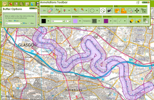
I’m working on the development of a new linear buffer tool for the Digimap for Schools service. Linear buffering is a common feature in GIS applications.

line-buffer-example

200 meters buffer on a part of river clyde in Glasgow

In geometrical terms such an operation on polygons is also known as Minkowski sum and offsetting.

I was looking of a Javascript library that would offer such functionality as OpenLayers2.13, currently used by Digimap for Schools, does not offer this as part of its codebase.

I came across 2 libraries that would offer this sort of functionality. One is JSTS andjsclipper the former being a port of the famous Java JTS Topology suite and the later being a port of the C++, C# and Delpi Clipper. I finally decided to go for jsclipper due to being unable to build a custom cut-down version of the huge JSTS library.

The resulting tool made use of jsclipper to calculate the buffer polygon along with OpenLayers, used to draw the buffer polygon and the inner linear path.

A standalone example along with the code, making use of EDINA’s OpenStream service, can be found here:  (Full screen here)

One of the challenges encountered was jaggy rounded ends on low buffer widths which is due to the way jsclipper handles floats. Fortunately jsclipper provides a method to scale up coordinates before passing them to jsclipper for offsetting and then scaling them down again before drawing. The Lighten and CleanPolygons functions also provided a way to remove unnecessary points and merge too-near points of the resulting buffer polygon.

All in all, jsclipper is a light, fast and robust library for polygon offsetting and would recommend having a look at it: https://sourceforge.net/p/jsclipper

Top 5 geo books for Xmas

Following up on yesterdays post about presents for geo-geeks, here is a list of books that geo-geeks might like to receive this Christmas. There has been a recent flurry of map related books and this list will focus on these more mainstream publications rather than the technical titles you might find in the “Books” section of GoGeo.

1. Around the world atlas:  this looks like a great modern take on the classic atlas for children.  Bright, colourful and full of interesting facts represented by infographics. Price: £32

Atlas

Around the world in 80 pages

2. Maps: This book of maps is a visual feast for readers of all ages, with lavishly drawn illustrations from the incomparable Mizielinskis. The maps show not only borders, cities, rivers, and peaks, but also places of historical and cultural interest, eminent personalities, iconic animals and plants, cultural events and many more fascinating facts associated with every region. Price £11.

Maps

Maps and more

3. Pocket Atlas of Remote Islands:  A small book that only contains maps of remote islands.  Many of which you have never heard of, and that you will probably never get the chance to visit.  The cartography is quite simple, but that is the beauty of this book. Most of the islands could easily be Treasure Island if you allow your imagination to run aways a bit. Price £10

Islands

Pocket Islands

4. The Lands of Ice and Fire: If you are into the Game of Thrones then this is a must. A dazzling set of maps, featuring original artwork from illustrator and cartographer Jonathan Roberts, transforms Martin’s epic saga into a world as fully realized as the one around us. Price £20.

FireandIce

Game of thrones

5. From Here to There: A series of hand-drawn maps that map both real and imaginary places as well as some slightly “off-the-wall” maps.  From Here to There bridges cartography and art. Price £10

tothere

Hand drawn maps


Creating a transparent overlay map with mapbox-ios-sdk

For this blog post i have managed to capture on of EDINA’s mobile developers.  Their guest article will describe how to create transparent overlays for mobiles using mapbox-ios-sdk.

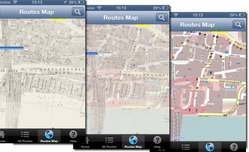
I am working on a historic map overlay, where the user can adjust the transparency of the historic map. The user can then see the how the land use has changed over time by using the slider.

opacity-map-overlay

I am going to use the map-box fork of route me. Looks like a good bug fixed version of Route-me and map-box do seem to have great some great products.

Unfortunately it doesn’t have an have an API to dynamically change the opacity of a tile source out the box. So I added it.

Its pretty easy to add. Each tileSource has a RMMapTileLayerView container when added to the map. Within that can manipulate the CALayer.opacity to get the desired effect.

I added a fork to github for testing

https://github.com/murrayk/mapbox-ios-sdk/

And example of use – the code is in github. Do a ‘git clone –recursive’ to install the submodules.

https://github.com/murrayk/mapbox-overlay-opacity-example

And example of use. In the  main view controller.

- (void)viewDidLoad
{
    [super viewDidLoad];
        // Do any additional setup after loading the view, typically from a nib.
    RMOpenStreetMapSource * openStreetMap = [[RMOpenStreetMapSource alloc] init];
    RMGenericMapSource * weatherMap = [[RMGenericMapSource alloc] initWithHost:@"tile.openweathermap.org/map/clouds" tileCacheKey:@"cloudCover" minZoom:0 maxZoom:18];

    self.mapView.tileSource = openStreetMap;

    [self.mapView addTileSource:weatherMap];

    self.overlay = weatherMap;
    // rough bb W = -30.0 degrees; E = 50.0 degrees; S = +35.0 degrees; N = +70.0 degrees
    NSLog(@"zooming to europe");
    CLLocationCoordinate2D northEastEurope = CLLocationCoordinate2DMake(70,-30);
    CLLocationCoordinate2D southWestEurope= CLLocationCoordinate2DMake(35,50);
    [self.mapView zoomWithLatitudeLongitudeBoundsSouthWest:southWestEurope northEast:northEastEurope animated:YES];

    [self.mapView setOpacity:0.5 forTileSource: self.overlay];

}

//hook up a slider to manipulate the opacity.  

- (IBAction)changeOverlayOpacity:(UISlider *)sender {

    NSLog(@"Slider value changed %f", sender.value );
    [self.mapView setOpacity:sender.value forTileSource: self.overlay];
}
If you found this blog useful, you might want to look through the archived articles on EDINA’s developers Geo-Mobile blog


FOSS4G – a developers review – part4

The 4th and final EDINA developers eye view of FOSS4G 2013.  This one is from Tim Urwin who is the Digimap Service Manager.  Tim has been working at EDINA pretty much from the start of it’s internet mapping adventure and has seen software and toolkits come and go.

Who are you?
My name is Tim and I’m the senior GI Engineer at EDINA in charge of the Data Team and I’m the Operation Service Manager for Digimap. My interest in attending FOSS4G centred around three key components of the Digimap Service: WMS Servers, WMTS options and Database, although I delegated most of the latter to Mike due timetable clashes.

What did you hope to get out of the event?
My aim was to catch up on the latest state and future options of current software used by EDINA services and to find out more about the various open source WMTS options available.

Top 3 things? (Ed – no trains Tim!)


  • Chris Tucker’s MapStory keynote was inspirational and well-presented and it is certainly a site I’ll be tracking to see where it heads.
  • Ben Henning’s key note on think before you act for cartography was quite thought provoking.
  • Paul Ramsey’s PostGIS Frenzy talk was as funny as it was informative, and I only caught the re-run. Lots of good information combined with useful tips. (Ed- Paul’s a star, there wasn’t enough room for everyone first time round so he kindly offered to repeat the talk)
  • Honourable mention must go to the Festival of the Spoke Nerd – very, very funny
What will you investigate further?
MapCache and MapProxy WMTS software to replace our existing tile caching option and catch up with all the presentations I couldn’t attend due to timetable clashes. (Ed – remember that all the talks (hopefully) will be available on the FOSS4G YouTube channel when we get them sorted and uploaded)
One closing thought is that it was heartening to see that despite all the professional headaches that Digimap has caused me over the years that our approach to and delivery of the service has been validated as several leading data supply agencies have very similar service architectures. Built with Open Source software at the core, although there with some proprietary components for certain tasks. The primary differences being in WMS and caching software options, although they’ll be closer aligned once we upgrade to a more modern tile caching platform. Now only if we could also have their hardware – they have significantly larger number of servers :)

Oh and as I wasn’t allowed this in my Top 3 – seeing 45108 running again after 16 years of hard work by its custodian group.

FOSS4G – a developers review part 2

Photo – Addy Pope

This is the second part of EDINA’s developer review of FOSS4G 2013.  This time it is Mike Gale who will be providing his opinion on what was presented.

Who are you:

Michael Gale – GIS Engineer / Member of the EDINA’s Data Team. My job is to essentially deal with the vast quantities of GIS data we utilise at EDINA. I translate, modify, split and twist the data we receive into types and formats that our services such as Digimap can then offer to our users. I heavily use the Swiss army knife – GIS command line tools of GDAL/OGR and additionally Safe FME, Shell Scripting, Python & PostGIS.

What you hoped to get out of the event?

To discover the latest and greatest ways to utilise the tools I already use. I was keen to evaluate what advances and benefits PostGIS 2.0 could offer – particularly with 3D data, LiDAR point clouds & pgRouting. Additionally I wanted to discover new ways of integrating Python into my workflows.
Top 3 things you saw at the event (not the food or beer….)

(1) Chris Tucker keynote – MapStory.org

MapStory.org is a new website that empowers a global user community to organise knowledge about the world spatially and temporally. It is essentially a social media platform where people can crowd source geospatial data and create “MapStories” with spatio-temporally enabled narratives. The best way to figure out what that all means is to check out the website!!

(2) Cartopy & Iris – Open Source Python Tools For Analysis and Visualisation – Dr Edward Campbell (Met Office)

Cartopy is a new python mapping library for the transformation and visualisation of geospatial vector and raster data. The library offers the ability for point, line, polygon and image transformations between projections and a way to visualise data with only a few snippets of python code. Iris is a python library that specifically deals with analysing and visualising meteorological and oceanographic datasets, particularly 3D and temporal data.

(3) LiDAR in PostgreSQL with Pointcloud – Paul Ramsey

PostGIS support for LiDAR data has been non-existent until now. Paul Ramsey has created a new spatial data type for PostGIS 2.0 that now offers the ability to import huge amounts of point cloud data, and additionally analyse the information with several new postgis functions. Pretty impressive.

(4) I’ll throw a comedy one in as well: “Up all night to get Mapping”: http://www.youtube.com/watch?v=_EEVYHUQlkU

Editors note: view at your own (ears) risk.

1 thing that you are definitely going to investigate further

The IRIS and Cartopy Python libraries.

Thanks Mike.  I hope to add another couple of review next week.  My overview, with links to as many reviews as i could find, can be found HERE


FOSS4G – a developers review part 1

Panos – Edina Developer

As well as being part of the Local organising committee, EDINA sent a number of developers to FOSS4G.  In the first of a series of guest posts we find out what the developers thought of the event and what they will be following up.

First up is Panos. Panos graduated with an MSc in GIS from Edinburgh University 3 years ago and has been working for the geo team at EDINA since.

Who am I and in what I am interested in?

I am Panos and work in EDINA as software engineer. I maintain a service called UK Data Service Support and I am working on a project an EU FP7 project called COBWEB which focuses on mobile GIS development and sensor data. As you can see from my background I am mainly interested on mobile development, GEOSERVER and sensor data frameworks. I managed to attend most of the presentations that have to do with these topics.

What was I expecting?

I was expecting to see some more alternative mobile development solutions from the ones we use here in EDINA (Openlayers, jquery mobile, phonegap) and some more applications on sensor web. I am quite happy that I discovered some new software such as 52North and the fact that other people developed their mobile app with a similar way to us. So, let’s take them one by one:

Mobile development:

  • Most of the projects focused around OpenLayers mobile/leaflet/jquery mobile/sencha touch and phonegap.  EDINA have used a similar blend of technologies in our mobile app, Fieldtip GB. There were many similarities in how they designed their apps, the feedback they received from users, the workflow they followed and the problems they had with touch events on different devices.
  • The outcome is that they would take a similar approach but they would perhaps try an alternative to phonegap.
  • One smart approach they had on visualizing lots of vector data on a small screen was to use MapProxy to merge raster and vector data to deliver a WMS.  The touch event of the users then searches for the closest feature and the app asks for the corresponding WFS returning information for the correct feature.

GEOSERVER:

  • Geoserver 2.4.0 has some new interesting features. The most interesting for me is a monitoring system for checking what kind of users are using the app and what kind of data they are accessing. It’s a nice solution for monitoring the use you have on GEOSERVER and there is even a GUI for it.  I plan to investigate how we might implement this in the UK Data Service Support.

Sensor Web:

  • Unfortunately, the work that has taken place on this is quite limited. It’s mainly about hydrology.
  • North52 (https://github.com/52North/) seems like a promising framework that can adapt to all different scenarios about sensor data. Some people have used for covering the scenario of if someone should go for hiking by considering factors such as birch pollen, meteorology and air quality. This may be useful for COBWEB.

Following up:

I’ll definitely try to investigate the new GEOSERVER functionality and 52North framework in order to see how I can benefit from them in my new projects. I’ll keep you posted with my progress. I would also like to say that these 3 presentations that I watched are not the only one that I found interesting. There are more that are equally interesting such as leaflet, geonode, ZOO project, cartoDB, iris project and cartopy.  You should be able to watch these through ELOGeo in a couple of weeks.