Dancing with Data

I went to an interesting talk yesterday by Prof Chris Speed called “Dancing with Data�, on how our interactions and relationships with each other, with the objects in our lives and with companies and charities are changing as a result of the data that is now being generated by those objects (particularly smartphones, but increasingly by other objects too). New phenomena such as 3D printing, airbnb, foursquare and iZettle are giving us choices we never had before, but also leading to things being done with our data which we might not have expected or known about. The relationships between individuals and our data are being re-defined as we speak. Prof Speed challenged us to think about the position of designers in this new world where push-to-pull markets are being replaced by new models. He also told us about his research collaborations with Oxfam, looking at how technology might enhance the value of the second-hand objects they sell by allowing customers to hear their stories from their previous owners.   Logo for the Tales of Things project

All very thought-provoking, but what about the implications for academic research, aside from those working in the fields of Design, Economics or Sociology who must now develop new models to reflect this changing landscape? Well, the question arises, if all this data is being generated and collected by companies, are the academics (and indeed the charity sector) falling behind the curve? Here at the University of Edinburgh, my colleagues in Informatics are doing Data Science research, looking into the infrastructure and the algorithms used to analyse the kind of commercial Big Data flowing out of the smartphones in our pockets, while Prof Speed and his colleagues are looking at how design itself is being affected. But perhaps academics in all disciplines need to be tuning their antennae to this wavelength and thinking seriously about how their research can adapt to and be enhanced by the new ways we are all dancing with data.

For more about the University of Edinburgh’s Design Informatics research and forthcoming seminars see www.designinformatics.org. Prof Chris Speed tweets @ChrisSpeed.

Pauline Ward is a Data Library Assistant working at the University of Edinburgh and EDINA.

Share

New Design for SUNCAT

As part of the SUNCAT Redevelopment we reported on last week, we will be introducing a new contemporary design for the SUNCAT web interface.

A number of designs were produced by EDINA’s in-house designer, based on a design brief submitted by the SUNCAT team based on

Feedback suggested that the current design was well liked but was starting to look somewhat dated so some key elements of the brief included:

  • Keeping the SUNCAT logo and colours for continuity
  • Keeping the search functionality at the heart of the design
  • Incorporating other elements of the site into the search homepage to reflect a more portal style approach
  • Trying to keep the design clean and simple.

After the initial set of designs was discussed and adapted by the SUNCAT team, the selection was narrowed to two preferred designs which were then circulated to EDINA colleagues for comment.

We were then keen to consult our SUNCAT contributors to involve them in the final selection and to gather feedback which could be incorporated into the ultimate design. A short online survey was made available to SUNCAT contributing libraries for a week at the beginning of November. Sixty responses were received in total, from at least 26 different libraries.

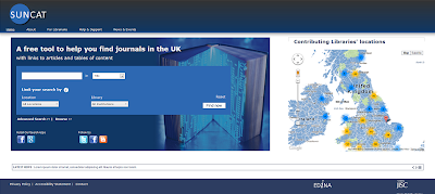
Seventy-two percent of respondents preferred the design displayed below, one percent liked both designs equally and happily none of the respondents reported that they didn’t like either design. The main reasons for preferring the design below included:

  • Simpler, cleaner and more user friendly
  • Preferred colours and images
  • Layout of search and filters on the screen 
  • Having a map of contributing libraries and a newsfeed easily accessible on the homepage

New Design for SUNCAT Interface

We will now be looking at some of the suggestions on how to improve the design, such as:

  • Changing the colour of the “Find Now” to better differentiate it from the limit options
  • Moving the Advanced Search and Browse buttons closer to the main search box
  • Moving the Reset button to beneath the “Find Now” button.
The new design will form part of the beta release of the new platform in spring 2013, please let us know if you have any comments about SUNCAT’s new look in the meantime.

Redevelopment of SUNCAT Platform

EDINA has embarked on a programme to redevelop the existing SUNCAT search platform. The impetus for this redevelopment emerged from a long held desire to not only provide enhanced functionality but also to be able to be more responsive to user feedback regarding suggested improvements.

Work commenced on the first phase of this development in spring 2012 as EDINA developers started to design and implement an entirely new bespoke user interface for the SUNCAT service.

In this initial development phase SUNCAT will continue to rely on Ex Libris’ Aleph software to load and de-duplicate contributing libraries’ serials records. The web interface however, will be developed in-house leveraging the open source enterprise search platform, Solr to facilitate highly efficient searching across the millions of SUNCAT records.

The developers considered a number of options to facilitate record searching, but Solr proved to be the best solution for dealing with the complex issues around searching and displaying records grouped into matched sets, a central component of the SUNCAT service. Moving to this open source platform should allow EDINA to have greater control and flexibility over the functionality and presentation of SUNCAT.

One key area of improvement, which will be available from the outset, is the ability to limit search results restricted to holdings from multiple libraries and locations. These limits will include all the individual locations of each of our contributing libraries, rather than just locations at an institutional level as with the current service. Another benefit will be that users will be able to select multiple locations and/or institutions to limit their search by, so giving them great flexibility. The limits will now also ensure that users only see the holdings from locations or institutions they are interested in, as any extraneous holdings will no longer be displayed. These improvements mean that in the future EDINA will be able to provide customised views onto the service, configurable at both the individual user level, and also at a higher geographic, subject specialist or consortial level.

The improvements to the geographic limits are particularly important for the mobile application which is also currently in development. EDINA conducted some early user testing with a small group of volunteers earlier in the year and it is hoped that a beta version will be made more widely available early in 2013.

Other key areas of new functionality will follow throughout the next year. The SUNCAT team have identified a wish list of features based on user feedback and also on a survey of some of the best functionality available in commercial search engines, library and union catalogues in the UK, Europe and beyond.

The feedback and survey also informed the design brief for the redeveloped service. Having considered a number of designs the SUNCAT team have narrowed the selection down to a few favoured options and we are currently consulting with our contributing libraries to decide on the final design.

It is hoped that a beta version of the new platform will be available in spring 2013, when we will be asking our users to provide feedback on progress. We hope that you will approve of the changes to come!

Project Recap

With the USeD project drawing to a close it is a good time to recap on what we set out to achieve and how we went about it.

Overview

The USeD project aimed to improve the usability and learnability of a user interface which enabled users to download spatial data from the Digimap service. The current data downloader is a popular service but is perhaps not the most user friendly.  It was designed around the technical constraints of the software of he time (2002) and the requirement that it had to integrate with an inflexible server-side database.

It’s replacement would be designed around the needs of the user but would still have to integrate with a server-side database. However, the new database is more flexible and data extraction far simpler.

The new interface must serve all users from experienced users who know what they want to complete novices who are perhaps less confident working with spatial data.  The interface should therefore be intuitive and learnable, allowing users to explore some of the advanced functionality as they gain confidence. You can read a detailed summary on the  About USeD page.

Persona

The first task was to interview some users and create a set of user personas. 20 users were interviewed and this resulted in 5 distinct personas.  The personas would be used to shape the user requirements and would be used to steer the design of the interface throughout the project.  You can meet our personas on the persona page.

Design Specification

The design specification can be divided into 2 parts; user requirements and a technical specification.  The user requirements were defined from the user requirements.  In the personas we had created a list of “pesron X wants to” and “We would like person X to”.  which made it quite a simple task to put together an initial list of requirements.  We grouped the requirements into:

  1. a user must be able to
  2. a user should be able to
  3. a user could be able to

Grouping the requirements like this gave the engineers an idea of the importance of each requirement which made it easier to justify spending more time implementing small functions that were deemed to be a must. The user requirements documentation can be found here

The technical review focused on the software and libraries that could be used to make the new interface more attractive and interactive. The server side database had already been updated so new tech had to integrate with this.

Prototype or Full Build?

This was a key question in the project. Do we use wire-frame mockups to show different designs or do we use a fully functioning test site?  We went with the fll build as we suspected that there would be issues surrounding the strong visual map window and the expectation of what the used would receive in their order. It was felt that a wire-frame would not address these issues. Building fully functioning test sites involved far more developer time and effort, but it was certainly worth it.

Iterative User Testing

We used task based testing to explore the usability of the new interface.  We started with an expert review from our usability consultant, this caught a number of issues that we had missed. The task based testing engaged with real users. Each user had 45 mins to complete a number of tasks and we tried to have 6 people per session. The interface was then modified between sessions. We ran 3 sessions and saw our “problem points” migrate from the initial screen through the ordering process. This was encouraging as it suggested that users were able to progress further in progressive session before they ran into problems. The user testing is described in detail in a number of post.

Project hand-over

Handover

Handover – Tableatny @ Flickr

At the end of the project we will hand over our findings to the Digimap Service team. The hand-over will be a document that outlines a number of improvements that can be made to the existing interface. Each recommendation will be ranked as either High, Medium or Low.  Each recemondation will address an identified isue in the current interface and will suggest a solution which has been implimented and tested during the USeD project.  Where multiple solutions were trialed, a brief summary of this will be given to justify the final suggestion.

This style of documentation proved to be a very effective way of suggesting improvements to the development team.


Version 4 User Testing

The final round of interface testing will follow the same format as the previous sessions.  6 candidates will run through a series of tasks designed to test the usability of the interface.  Once again, candidates were selected from a list of registered Digimap users.  The main findings of this testing session are summarised below:

1.  Text Search

The “No results message boxâ€�  should include the following text “No results found for ‘dasas’ please check the spelling or try an alternative. You can search by Place name, Postcode or Grid refâ€�

The button used to close the search box currently says “Select and Close�  Several users found the term Select confusing. Change this to be “Close� and fix the tool tip.

2. Draw Rectangle

There were a couple of issues with this. The default function should always be pan, however it is possible to have draw rectangle and use coordinates/use time name selected. You should only have 1 select function active at any time.  A user selected a tile through use tilename and then returned to the map and wanted to pan, but their first click cleared the selection as the draw rectangle button was still active.

A wider issue to think about is that does the absence of a pan button confuse users and prevent them from panning? Or, is the current system learnable?  We could improve the help and the tool tip to improve the learnability of this toggle “ON – Draw rectangle to select data. OFF – Pan the mapâ€�

3. Add to basket error

Change txt to say “You have too much 1:10 000 Raster data in your basket, the limit is 200 tiles.  Either reduce your selected area or select another product�

4.  My Account

Further refinements are needed in the My Account section.  The Green Envelope and Blue rubbish bin worked well visually.  These should be the only clickable elements in each row.  Once selected, the bottom grid should populate and if the order botton is pressed this will re-order the complete order. Only if the user checks one of the check boxes will the order be split. So, all the radio buttons should be checked when the bottom grid is populated.

5. Preview

Add in a preview for datasets that are UK wide.  The lack of a preview confused more than one candidate. Tooltip on Preview is not right

6. Use Coordinates

Order of information is now confusing.  Map example was useful but the input boxes should sit below this image.  The OR options can then sit below the input boxes. We also need an error box on “Get coordinates form selected area� to catch when users have no area selected.

7. Use Time Name

Change the text below the txt input box to read “Click the “� icon on the right of the map to view tile grids at anytime.

Summary

Overall, Version 4 user testing was quite encouraging. No major issues were discovered. The feedback from the users was positive and the issues that were identified were generally quite small.  They focus on things that would make the interface clearer and more learnable.

The plan now is to collate the findings from the usability testing and produce a number of recommendations on how to improve the version of the data downloader that is currently live as a beta.  Recommendations will be supported by the evidence gathered during this user testing program.


Version 3 User Testing

Repairs

This round of testing concentrates on Version 3 of the New Data Downloader User Interface. The two previous interfaces have undergone an “expert review” and testing with EDINA staff.  Many issues have been identified and solutions have been implemented.  This version of the interface will be tested with actual users.

Finding Users

Finding actual user who could test the interface meant returning to the Digimap user log.  We identified staff and students who had used the current downloader and who were affiliated with an institution in the Edinburgh/Glasgow area. Candidates were divided into three categories:

  1. those that had used the current downloader 5 times or more
  2. those that had used the current downloader less than 5 times
  3. those that had used other digimap services but had not used the current downloader.

We stuck to roughly the same format as the previous user testing session, a series of 5 set tasks that would explore much of the interface and site functionality. Each candidate would have a maximum of 45 minutes to work through the tasks leaving 15 minutes for discussion between the facilitator and the observer. We intended to have 6 candidates starting at 10am giving adequate time, or so we thought, to check the system was working on the day of the test.

We tweaked the tasks slightly, making changes to the way we presented information to the candidates.  This was in response to feedback from the first round of testing with internal EDINA staff.  It is amazing what candidates will extract from your handout that you have not even noticed and sometimes small pieces of information bias or mislead a test. This highlights how important a dry run is before organising sessions with external users.

Lessons

So what did we learn from this session?  Well this can be separated into things that would improve how we ran tests and things to improve the user interface.

About the test:

  1. Set up the lab and test that everything works on the day of the test. Do not assume that just because it worked yesterday it will work today
  2. run through the actual tasks during your test as if you were a candidate. (i tested the new interface on my computer and it was fine, but the first candidate struggled and “things” just didn’t seem right.  A bit of panicking later we discovered that the UI didn’t run quite as intended in Firefox 8. The 15 minutes between candidates gave me time to download Chrome and test that everything was working)
  3. Try not to run a session on the same day as a fire alarm test. (yup, 5 minutes into the first candidates session the fire alarm went off and stayed on for over a minute.  This was a scheduled test and i had completely forgotten about it.  Live and learn.)
  4. Keep calm and carry on – even when everything seems to be going wrong you can still get something out of a session.  If you discover a bug, just get the candidate to move on.  If the interface becomes unusable, or the candidate gets flustered and disengages, just move onto discussing the interface and the process. Ask some questions that dont require them to use the interface such as  “how would they like to interact to get data” or “what similar interfaces have they used, in this case it might be google maps or bing maps. This may allow you to ease them back into the tests.
  5. Dont worry if the candidate seems shy and isnt saying much. Remember to ask them to explain what they are doing and why and they will most probably relax into the situation. A slow, quiet user who takes time to thing can provide insightful feedback, you just have to coax them into thinking out loud.
  6.  “how would they like to interact to get

About the User Interface:

  1. Some users found it difficult to see what button to press on the Basket popup, they were not sure if the appearance of this window indicated that their order had been placed, or if they still had to “do” something to place the order.(closer examination of this issue reveals that some of the confusion may be related to two buttons that were added to the My Basket window between version 2 and version 3. They are the same size and colour as the Place Order button and may dilute the importance of the Order button.)
  2. The “Add to Basket” button was still not prominent enough, users often did not spot it. (we had already tweaked this and in this version, the button was initially grey, then flashed red when items were selected from the product list, and was then blue like the other function buttons.)
  3. All pop-up windows must close when an action button is pressed.  User often left thinking they still have something to do in the pop-up.
  4. Toggle between pan and draw rectangle still not absolutely clear.  Moving the search function out of the select area has helped but more thought needed on how to make this toggle clearer to the user.
  5. My Account section is confusing to users.  Not sure why there are two grids displayed.  Need to think how to make this section clearer to users when it appears but retain the functionality of re-ordering an order or part of an order.
  6. Selecting data through the Bounding Box not clear to all users. Some struggled to interpret the Upper Right X/Y and Lower Left X/Y diagram. (not clear if users struggled with this because they were not initially sure what a bounding box was, or what X/Y were. However, we hope that the interface will be learnable so that novice users will be able to learn how to select data using things like the bounding box through the information presented to them in the UI. The language and terms used in the UI are industry standard terms which are useful to know if you work with spatial data.)
  7. Add a text input box to sit alongside the search button.  A couple of users didn’t initially use the search function and commented that they hadn’t spotted it and were instinctively looking for a text input box where they could add search terms.

This is just a summary of the main points that we extracted from the session. You will find the complete list in the Version 3 User Testing Report (LINK).

Summing Up

Overall, the testing was a success and we have a number of development tasks that we can focus on.  Previous testing had identified issues with the process of selecting an area, selecting data and adding it to the basket. This seems to have been largely resolved and we have seen a migration of the main issues to the Basket and the My Account sections.  This is encouraging and suggests that the initial steps are now more intuitive.

However, some of the changes we implemented after Version 2 seem to have created as many issues as they have solved.  This is particularly clear in the case of the Basket.  Adding two extra buttons (clear basket and add more data) appears to have diluted the importance of the Place Order button.  This is unfortunate as the most important button on the Basket pop-up is the Place Order button.


Data Downloader Version 3

We have been working on the recommendations that came out of the second round of user testing (with internal EDINA staff) and Version 3 of the Data Download tool is ready to be road tested.

Data Downloader Version 3

The main changes include:

  • Moved the pan & zoom and the search buttons out of section 1 and put them just above the map.
  • Added Products selected count to Data subsections
  • Cleaned up the “Add to basket” section
  • “Add to Basket” button now flashed when users select data.  Then stays red.
  • When users select “Use Time name” the national grid reference numbers will be overlayed on the map
  • Cleaned up the Basket Window.
  • Added “Draw Visible Area” button to the select functions

Hopefully some of these changes will help users to navigate the interface and request data. Time will tell.


Downloader Version 2

Working on the recommendations from the first round of user testing (expert review by the usability expert), Version 2 of the Data Downloader has been developed.

Data Downloader Version 2

The main improvements that have been implimented include:

  • isolate the search and pan/zoom function
  • add select visible area button
  • tidy up the products list
  • increase the prominence of the “add to basket” button
  • add “on hover” functionality to the rubbish bin and the info icons, make them change colour so users notice them.

The next step is to carry out some UI testing on this interface.  Organising external staff / students is time consuming so it has been decided that for the first round of UI testing we will use EDINA staff.  We should be able to replicate the personas from staff as we have people with a mix of geo knowledge.  The other advantage of this is that we will be able to use this round of testing as a dry run and get the usability Expert to observe the tests.  We will then get feedback and tips on running a UI test and hopefully improve our technique so that we get more out of tests with external users.

Recommendations from UI Testing 1

Based on the first round of UI testing and the report prepared by our usability expert, a number of suggested improvements were put forward for the data downloader.  Actually, the report prepared by David was very useful.  The report did a number of things that made it easy to discuss issues with the development team and identify the potential solution.  In particular, a UI testing report should:

  • Rank the reported issues  High, Medium and Low, you can decide to rank within these categories if you wish
  • provide an annotated screenshot
  • add supporting text description
  • suggest a solution, perhaps with a mock-up or link to another site that demonstrates the solution
  • report “bugs” separately
  • dont go overboard – listing 100 faults is not helpful. (note – hopefully you shouldn’t have 100+ faults if you have understood the who, what, why of the design brief)

The USeD development team were able to sit around a table and come up with a course of action on each one of the issues raised in the UI Expert report.  How long did this take? 60 minutes. That’s all, honest.  A well presented document that described each issue clearly meant the developer could concentrate on the technical solution and judge whether a solution could be implemented in the development time available. Only a couple of issues got “parked”.  This was generally to do with the capabilities of the software and hardware and implications of server load.

A list of the changes that we will make to the interface is given at the end of this post.  So what have we learnt from this initial review?

  1. the usability expert liked the new site so that was good.
  2. He pointed out several things that are now blindingly obvious to the USeD team.
  3. We now appreciate the benefits of presenting UI results clearly, they shape the development of the UI.
  4. We know that we can make the UI better and easier to interact with.
  5. We know what we have to focus on for version 2

We now have about 2 weeks of development time before we roll out Version 2 for some more UI testing.

Points that will be investigated for Version 2

  1. Remove “do one of the following”
  2. Isolate pan as it is a separate function to draw or select
  3. On load, products list should be collapsed
  4. Add better headers to products list such as “Product” “Allowance”
  5. Make it more obvious when an allowance is exceeded, perhaps red text or strike thru text.
  6. Add a modal box if a user selects a product for which the allowance has been exceeded
  7. Remove lock/unlock icon
  8. Make info button change on hover
  9. Add info about which data product is being viewed in the map window.
  10. Remove Scale-bar
  11. Define area buttons need cleaned up – perhaps 1 define button that opens a pop-up
  12. Add more descriptive help to functions like define Square in the popups
  13. Popup and modal boxes should close when “GO” is pressed
  14. In basket, change preview and trash can to change colour on hover
  15. Give the “Add to Basket” button more prominence.
  16. Greyed out buttons too subtle (add to basket/define circle(not functioning at present))
  17. Are arrows the best symbol to use for clickable function submit buttons?
  18. Possible to get lost in map, have a reset view (planned but functionality issues prevented it going out in Version 1)

Aspects that we could not take forward with an explination of why.

  • Change the product names to be more meaningful and descriptive – the OS are insistent that their products should described by the correct products name. We also agree that this is sensible as many products are quite similar in some ways, but different in others. Conveying this in 2-50 characters would be difficult.  Further, using the official product name means that Digimap users are using the correct terms that are used in the public and private sectors.
  • When a user selects a product, update the map window to show the product. This would make a stronger visual link between what users see and what they eventually get. The preview windows are too small to be very useful. – This would be possible for some products but initiating this to say preview Mastermap or other large scale mapping products.  The load on the server to facilitate this could potentially be considerable and impact on the speed of the service. In addition, maps would not render in a readable format on screen if users tried to view large areas of large scale maps.

Link to the usability report prepared by Usability Expert