Official Launch of historical maps in Digimap for Schools

Today sees the official launch of historical maps  in Digimap for Schools.  The formal launch of this fantastic new addition to Digimap for Schools, made possible by the generosity of the National Library of Scotland, will be celebrated at the annual Geography Association conference taking place on the 14th and 15th April at the University of Surrey.  It was at this same event, at the same venue in 2011 that Digimap for Schools received the Geographical Association Publisher’s Gold Award for making a significant contribution to geographical education and professional development.

The service has grown in popularity since 2011 with over 20% of secondary schools in England and over 30% in Scotland now using the service. Dr Vanessa Lawrence CB, Director General and Chief Executive, Ordnance Survey will mark the launch during her conference lecture this afternoon.  Chris Fleet, Senior Map Curator at NLS says ‘Old maps present our history in one of its most enthralling forms.  We are delighted to be collaborating with Ordnance Survey and EDINA in delivering our historic maps to schools through the Digimap for Schools application.’  Peter Burnhill, Director of EDINA says ‘Students, pupils and their teachers now have unrivalled access to the very best maps to gain rich understanding of how Britain’s landscape has changed in over a century.  The result is endlessly fascinating, the skill and generosity of staff at the National Library of Scotland have enabled a real sense of place when combined with the Ordnance Survey maps of today’s Britain’.

Full press release can be read here http://www.ordnancesurvey.co.uk/about/news/2014/digimap-for-schools-launches-historic-maps-of-great-britain.html

The search for Flight 370

flight370

courtesy of Wayan Vota (https://www.flickr.com/photos/dcmetroblogger/)

As the search for missing Malaysian Airways Flight 370 approaches it’s 5th week, the reliance of Geospatial technology and the skills to analyse large volumes of data are becoming increasingly clear. In this post we will look at some of the geospatial technology and techniques that have been used in the search for Flight 370.

Background

Flight-370 disappeared on the 8th of March 2014 having left Kuala Lumpur en-route for Beijing. There was simply no trace of it. Communications were lost somewhere over the Gulf of Thailand. Speculation quickly rose as to the fate of the aircraft with hijack and rouge pilots being muted as possible explanations.  A catastrophic break-up of the aircraft through an explosion was not ruled out but looked unlikely as this would generally be noticed. Furthermore, there was no sign of debris in the area of Flight 370 last known position.

Data feeds and extrapolation

After a few days, data started turning up that suggested that the plane had stayed aloft for several hours after all communication was lost.  Equipment onboard transmits information such as status updates and diagnostics.  The engineering teams can then monitor the health and performance of components while they are in use.

The engines had sent burst of data every hour and these had been picked up by a satellite operated by Inmarsat. By monitoring the Doppler effect in the received data, Inmarsat was able to chart 2 possible paths; one to the north and the other to the south.  This had never been done before and the innovative use of this data by Inmarsat allowed the rescue effort to be concentrated in 2 distinct areas.

After a bit of tweaking and refining, the Inmarsat scientists were able to discount the Northern corridor and the search re-focused on the Southern corridor, a vast expanse of ocean west of Australia with no suitable landing site.  How they achieved this was really quite clever. They used “truthing data” from other aircraft to monitor the Doppler effect and therefore refine their estimates for Flight 370. They then calculated the speed and altitude of the aircraft and were able to work out roughly where it would have run out of fuel and ditched into the ocean.  This greatly reduced the search area.

Satellite analysis

The search area had been focused to a small section of ocean (ok, so small in this case means the size of Western Europe, but given the size of the Southern Indian Ocean this can be considered to be small).  It was now feasible to start analysing aerial imagery to try and identify debris (given that there was nowhere for the plane to land, on the 24th March Malaysian officials announced that it was beyond reasonable doubt that the plane was lost after ditching in the Southern Indian Ocean). Trawling around to find out what satellites were used was harder than i thought it would be.  Below is a summary of what i found:

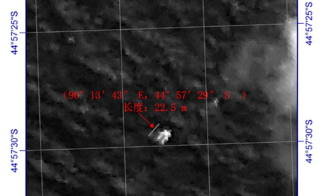
  • GAOFEN-1 – a high-resolution optical sensor run by CNSA (Chinese National Space Administration) which was launched in April 2013. Gaofen-1 is equipped with a 2 metre resolution CCD (Charge-Coupled Device), an 8 metre resolution multi-spectral scanner and 16 meter resolution wide-field multi-spectral imager. It is difficult to tell which sensor produced the image below, but from the resolution it looks like it was the 8m res multi-spectral scanner.
chinese satellite

Chinese satellite image of possible debris – Pic from The Guardian/Reuters

  • A French satellite operated by Airbus Defense and Space spotted 122 objects in a cluster. The objects were up to 23m in length and in a cluster. (image released by MOSTI). Airbus Defense and space have a host of satellites run through their Astrium including EnviSAT, CryoSAT, Copernicus, ELISA and Helios 2.
French

Airbus Defence Image

  • Australian AP-3C Orion – Orion aircraft were deployed to likely search areas and scanned the area.  It is likely that the crew were using a combination of electronic surveillance system and just their eyes. This might seem like old-school, but it is an effective method of verification as trained operators can discount or confirm sightings from remote sensing. The aircraft has a long-range and can fly low making it ideal for searching.

Ocean Currents

Why has it taken so long to refine the search area?  Well there are lots of satellites, but only a few of them would have had suitable sensors on-board. Data is collected and beamed back to a receiving centre. The raw data will most probably have to be processed before it can be used for anything.  This takes time.  The search area may well have been narrowed to a chunk of the southern Indian Ocean, but this still represents a huge area, not dissimilar to the size of Western Europe.  Processing and analysing data for such a large area is not easy and will rely on a degree of automation followed by humba verification.

The southern Ocean is a wild place with frequent storms. We can see from above the at optical sensors have been used and these will be unable to penetrate cloud cover. Scientists would have to wait for the satellite to pass over the same area to try and get a better, cloud-free image. The repeat cycle may be anything from 1 day to 10 days or more.

Then you add in the ocean currents.  Anything object floating in the ocean will not be static and could drift by 10′s of kilometres a day. Given that the plane is likely to have crashed 15 days previously, debris could be 100′s of kilometers from the crash site. That is, if it has not already broken up and sunk.  But we can at least model the ocean currents and estimate the potential dispersal of the debris.  The NY Times have some excellent visualisations of both the currents and the wave heights in the southern Indian Ocean during March.  These have been produced by the National Oceanic and Atmospheric Administration and the National Centers for Environmental Prediction through remote sensing data, in-situ data (buoys) and models.  While never 100% accurate, they provide an indication and convey the uncertainty involved in determining a search area.

Locating flight recorders

Once a search area has been identified, the searchers are able to deploy listening devices which locate “pings” emitted by Flight 370′s black box. This is achieved by towing a listening device (TLP-25) back and forth across a wide area.  Pings should be received periodically and the position and strength of these should triangulate the position of the black box. But the sea floor is not flat in this area. It is around 4500m deep with mountains up to 2500m high.  We actually know very little about remote ocean sea beds.  We have limited data collected by ships and most representations come from spaceborne remote sensing data. These are not very accurate and may “miss” large structures (1-2km high) such as seamounts. There is nice overview of ocean mapping on the BBC website.

The difficulties of retrieving debris from deep, remote oceans was highlighted by the search for French Airlines flight 447.  In this case, both black box transmitters failed.

A Chinese ship detected a ping on the 5th April and a day later an Australian ship detected a ping.  But the pings were quite far apart.  The Australian ships detection seemed more consistent and stronger and this was backed up by more detections in the same area on the 8th. It is a slow process, but each detection should help reduce the uncertainty.  The question is, will the batteries in the transponders last much longer?  They are already at the limit of what is expected so time is running out.

Remote Sensing Critical

It is clear that remote sensing technology has been critical in every stage of the search for Flight 370.  It will continue to be so until the plane is found.  It has been used effectively to narrow search areas and discount blind alleys. It is also interesting to note how associated data has been used in ways that it was not intended to locate the plane and praise should be given to the Inmarsat scientists who came up with a novel solution when data and information was scarce.

Articles:

  • The search for Malaysian Airlines Flight 370 – a great article in the New York Times that focuses on the remote sensing data that is being used now that search teams have identified a “likely” crash site in the Southern Indian Ocean.
  • Wikipedia – a growing resource for information about Flight 370
  • Wikipedia – French Airways flight 447
  • NY Times – nice collection of visualisations of ocean conditions in the search area

Top 5 geo books for Xmas

Following up on yesterdays post about presents for geo-geeks, here is a list of books that geo-geeks might like to receive this Christmas. There has been a recent flurry of map related books and this list will focus on these more mainstream publications rather than the technical titles you might find in the “Books” section of GoGeo.

1. Around the world atlas:  this looks like a great modern take on the classic atlas for children.  Bright, colourful and full of interesting facts represented by infographics. Price: £32

Atlas

Around the world in 80 pages

2. Maps: This book of maps is a visual feast for readers of all ages, with lavishly drawn illustrations from the incomparable Mizielinskis. The maps show not only borders, cities, rivers, and peaks, but also places of historical and cultural interest, eminent personalities, iconic animals and plants, cultural events and many more fascinating facts associated with every region. Price £11.

Maps

Maps and more

3. Pocket Atlas of Remote Islands:  A small book that only contains maps of remote islands.  Many of which you have never heard of, and that you will probably never get the chance to visit.  The cartography is quite simple, but that is the beauty of this book. Most of the islands could easily be Treasure Island if you allow your imagination to run aways a bit. Price £10

Islands

Pocket Islands

4. The Lands of Ice and Fire: If you are into the Game of Thrones then this is a must. A dazzling set of maps, featuring original artwork from illustrator and cartographer Jonathan Roberts, transforms Martin’s epic saga into a world as fully realized as the one around us. Price £20.

FireandIce

Game of thrones

5. From Here to There: A series of hand-drawn maps that map both real and imaginary places as well as some slightly “off-the-wall” maps.  From Here to There bridges cartography and art. Price £10

tothere

Hand drawn maps


Top 10 Christmas ideas for geo-geeks

It’s that time of year again.  Finding the perfect gift for those that we care about and trying to be just a little bit different or going that extra mile to get a gift that really will be cherished.  Increasingly, us map geeks have a host of carto related gifts that we can buy each other.  This post highlights some of them and will hopefully stand as a bit of inspiration for anyone who wants to treat a geo-geek who has been particularly good this year.

First off, you could do worse than looking at the list that i put together last year. Some of the links no longer map(sic) to the correct product, but some do.  Beyond that, the list below should give you some ideas of what i have stumbled across this year:

1. SplashMaps - SplashMaps are REAL outdoor maps designed for clarity and accuracy.  They are Washable, Wearable, All-Weather Fabric maps.  Prices are about £20 for a standard sheet and bit more for a custom Make-a-Map sheet.  Note that Make-a-Map maps cannot be delivered before Christmas.  Please choose the Map voucher for an even more personalised gift. There is a useful image showing the availability of standard maps that would be delivered by christmas.

splash

Splash Maps


2. Escape  maps– Available through many sellers on ebay are genuine WW2 escape maps. These tend to be printed on silk and were issued to service men, generally RAF, when they were on missions behind enemy lines. The maps were light and easy to hide in clothing but gave service men routes to escape back to allied territory.  I may have bought one last year and it is beautiful! Buy one and you will own a little piece of history. Prices vary, but around £25.

escape

A little bit of history

3. Jerrys Map – If you don’t know what Jerry’s map is, then please look at this video.  You can buy tiles from the map, these are copies of the original, but as the map is constantly evolving you actually end up with something that is unique. Again, i may have already bought some tiles and they are amazing.  If you happen to be in Edinburgh (perhaps over Hogmanay) then you can see the actual map which is on show at Summerhall.  Tiles are available through Ebay direct from the man himself. Prices vary, but start at less than £5.

JerrysMap

Jerry and the map

4. Bespoke map art– Yes, i know they featured last year, but they have expanded their range and there is something for every type of map geek. Prices range from 35 to over £50.

MapArt

Map Art – in this case a clock!

5. Cartographic T-shirt – stylish -shirts with subtle cartography on them. Nonfictiontees – £12, TFL Beck Tube map – £12, Polar projection goodness – £16,

tshirt

Map on a t-shirt

6. Animal World Map– This is a massive wall map of the World for kids.  Each country is represented by the animals that are associated with it. Although the UK seems not to get any animals, just Big Ben. Surely we could have has sheep, salmon, a Highland Coo or a Haggis! Prices are £21 for an A3 copy and £26 for an A2 copy.

animal

One for the kids

7. Typographic Maps– another “where art meets maps”, these typographic maps show several cities of the World (London, New York, Seattle…..) but features are represented just by their names.  The A1 posters cost £26.

Typo

Typo? What typo?

8. Map Bling– Jewellery with maps on it for him or her?  Sorted. Prices from £15-£50.

Bling

Bling

9. Wapenmap- A Wapenmap is a 3D contoured stainless steel metal map landscape sculpture. Cost is about £18

3D

3D Maps

10. A map – any map.  A true map geek will get a kick out of receiving a map.  The map could be new, old, antique, foreign.  It could link into a trip or anything.  I have received a Terry Wogan weekender map (dont ask), and it is great.  I have given people old maps of where they live and taken pleasure as they analyse how things have changed (Oxfam is a great place to get an old OS or Bartholwmews map)

That’s your lot.  What, no books i hear you say! Well i will put a list of some top map related books tomorrow.

Note – thanks to James Cheshire who blogged his wish list earlier in the month and i have blatantly stolen 1 or 2 ideas from it ;)

Creating a transparent overlay map with mapbox-ios-sdk

For this blog post i have managed to capture on of EDINA’s mobile developers.  Their guest article will describe how to create transparent overlays for mobiles using mapbox-ios-sdk.

I am working on a historic map overlay, where the user can adjust the transparency of the historic map. The user can then see the how the land use has changed over time by using the slider.

opacity-map-overlay

I am going to use the map-box fork of route me. Looks like a good bug fixed version of Route-me and map-box do seem to have great some great products.

Unfortunately it doesn’t have an have an API to dynamically change the opacity of a tile source out the box. So I added it.

Its pretty easy to add. Each tileSource has a RMMapTileLayerView container when added to the map. Within that can manipulate the CALayer.opacity to get the desired effect.

I added a fork to github for testing

https://github.com/murrayk/mapbox-ios-sdk/

And example of use – the code is in github. Do a ‘git clone –recursive’ to install the submodules.

https://github.com/murrayk/mapbox-overlay-opacity-example

And example of use. In the  main view controller.

- (void)viewDidLoad
{
    [super viewDidLoad];
        // Do any additional setup after loading the view, typically from a nib.
    RMOpenStreetMapSource * openStreetMap = [[RMOpenStreetMapSource alloc] init];
    RMGenericMapSource * weatherMap = [[RMGenericMapSource alloc] initWithHost:@"tile.openweathermap.org/map/clouds" tileCacheKey:@"cloudCover" minZoom:0 maxZoom:18];

    self.mapView.tileSource = openStreetMap;

    [self.mapView addTileSource:weatherMap];

    self.overlay = weatherMap;
    // rough bb W = -30.0 degrees; E = 50.0 degrees; S = +35.0 degrees; N = +70.0 degrees
    NSLog(@"zooming to europe");
    CLLocationCoordinate2D northEastEurope = CLLocationCoordinate2DMake(70,-30);
    CLLocationCoordinate2D southWestEurope= CLLocationCoordinate2DMake(35,50);
    [self.mapView zoomWithLatitudeLongitudeBoundsSouthWest:southWestEurope northEast:northEastEurope animated:YES];

    [self.mapView setOpacity:0.5 forTileSource: self.overlay];

}

//hook up a slider to manipulate the opacity.  

- (IBAction)changeOverlayOpacity:(UISlider *)sender {

    NSLog(@"Slider value changed %f", sender.value );
    [self.mapView setOpacity:sender.value forTileSource: self.overlay];
}
If you found this blog useful, you might want to look through the archived articles on EDINA’s developers Geo-Mobile blog


Punchbowl Valley, Devil’s Chimney, Mousehole & Trap – Lundy place names

One of the most fun things about exploring maps, is the interesting and unusual place names you see printed on them.  This morning, while I was testing out one of the new enhancements coming soon in Digimap for Schools, I happened upon Lundy.  I’ve heard of Lundy but must confess to not knowing much about the island.

Panning around the 1:50,000 scale raster, 1:25,000 scale raster and VectorMap Local maps reveals an array of weird on wonderful place names that can tell you a great deal about the island – or make you wonder how some place names possibly came to be so called!

Some of my favourites are: Hen & Chickens, Frenchman’s Landing, Punchbowl Valley, Devil’s Slide, Mousehole & Trap and Goat Island.

Great Britain is full of such place names, what are some of your favourites?


Updated mapping – we’ve been busy!

We’ve been busy over the summer working away on enhancements to Digimap for Schools and carrying out our annual mapping update.

Over the last couple of weeks, we’ve released updates to most of the mapping products.

Miniscale, 1:250,000 raster, 1:50,000 scale raster and the 1:25,000 scale raster have all been updated to the latest 2013 data from Ordnance Survey.  These products make up the maps on the zoom levels 2 – 9 (as you zoom in from the GB view) in Digimap for Schools.

As these are small and mid scale products, any updates can be quite subtle.  But if you know somewhere that has experience significant construction in the last year or two, updates may be on the map now.

1:25000 raster 2012 example


1:20000 raster 2013 exampleFor the more larger scale mapping, a new data product – 

Introducing VML Raster – a new mapping product for Digimap for Schools

Many users will be familiar with the Ordnance Survey 1:10,000 scale raster mapping product that is used in Digimap for Schools on the 3rd most zoomed in view scale.  On 1st March 2013, Ordnance Survey announced the up coming withdrawal of this product from their mapping catalogue in 2014.  This has given us the opportunity to update the mapping used for this zoom level and add in OS VectorMap Local (VML) raster to replace the 1:10,000 scale raster.

OS have decided to withdraw the 1:10,000 due to the dated cartographic styling it uses.  The styling was developed in 1995 – so it is older than most Digimap for Schools users!!  The data has been maintained and updated with changes on the ground mapped, but the styling is now showing its age.

A detailed announcement from Ordnance Survey can be found here

VML raster is a much more modern looking mapping product and is more in-keeping with other the style of other map products.  You will hopefully agree that the flow through the stack in Digimap for Schools is much nicer with VML raster.

Example of 1:10,000 scale raster

VML raster exampleA new map key illustrating the symbology used on the VML raster will also be added, to replace the 1:10,000 raster key.

VML raster will be available in Digimap for Schools from 24th September , when we will be releasing a couple of great new tools – keep an eye out for the blog post about these new enhancements!  (Amendment: We actually exceeded our target of September 24th and have delivered it on the 27th August to ensure its ready for the new school term.  Many thanks to our hard working engineers for this! the new tools are still planned for September 24th!)

Fieldtrip GB – A data capture app from EDINA

EDINA, the Jisc funded data centre based at the University of Edinburgh,  has just released an app that allows users to capture data against high quality base maps.  Fieldtrip GB has been designed to support teaching, learning and research in Great Britain. In summary, Fieldtrip GB:

  • is free to download and use
  • uses high quality background maps that offer rich data in both urban and rural environments
  • allows maps to be cached for off-network usage
  • enables data capture
  • includes the ability to create custom data collection forms that allow users to define the data they want to capture.

So what does it look like?

The app is split into 4 sections; Home, Maps, Capture and Download and Sync.   In addition there is a header which displays active elements such as the GPS/GPS tracking and a footer which allows quick navigation between the sections (Fig 1).

Fig 1 – Fieldtrip GB Home Screen

Quality Cartography

Part of the appeal of Fieldtrip GB is the mapping it uses.  The maps have been designed and optimised for a small screen making them ideal for viewing on a mobile phone. One of the challenges when creating the app was to ensure that the mapping worked in both urban and rural environments.  This is tricky as user will be looking for buildings, roads and road names in urban areas but users in rural areas may be more interested in features such as contour lines and rivers. Getting the highest zoom levels right was tricky but a new feature in Mapserver 6.2 allowed the developers to create an urban mask. Areas that were considered to be “urban” would display OS Street View data, whereas “rural” areas would display OS VectorMap District data augmented with OS Land-Form PANORAMA contours and path data from Natural England. In addition, considerable effort was made to place labels in sensible places, not an easy task when you need to automate the process for the whole country. Examples of the cartography are shown below (Fig 2)

Fig 2 – Examples of the mapping in Fieldtrip GB (left to right – Urban, Rural, Urban-Rural boundary)


Off-line maps

We understand that mobile data connectivity is not reliable in many areas of the country. Fieldtrip GB has been designed to allow users to download maps to their phones prior to going into the field. This way they will be available when data connectivity is not. There is the additional advantage that you can use WiFi to download the maps and not eat into your data allowance.

Capturing data doesn’t require a data connection.  You can collect data all day, or in fact all month, and then upload it all when you are able to connect to a strong WiFi signal.

Capture Data

There are two ways to capture data in Fieldtrip GB; by using one of the standard capture elements which support text, images, audio and GPS tracklog capture, or through the custom capture forms.

The custom capture forms are created through the Fieldtrip GB Authoring Tool. This is a website that allows users to design forms by dragging elements into an editor and defining the specific parameters they want to capture (Fig 3). We think this is where Fieldtrip GB really stands out as a useful research tool.  The Authoring Tool allows you to design data capture to meet your specific research aims. Custom data capture forms are uploaded to you Dropbox folder so that they can be accessed from your phone. To load them on your phone, just login and then perform a sync. This will grab any new forms from Dropbox  and save them to your phone.


Fig 3 – Overview of the Authoring Tool

Here’s an example of a form, in this case it is for collecting information about rocks (Fig 4). There is a drop down selector allow users to specify sedimentary, metamorphic or igneous rock types, sliders to record dip and strike, a note book reference and a photo capture option. Quite simple things, but easy to record and data will be consistent. We added a field-note Book ref so users could tie the digital record to their paper notes which might include specific details or a sketch.

Fig 4 – Example of a custom data capture form

Upload –> Edit –> Share

Once you have captured your data you can upload it to your Dropbox account and then either access it from there or view, edit and export it through the Authoring Tool (the authoring tool is so much more than an authoring tool).  In the authoring tool you can export the data from GPX format to other useful formats such as KML. You also have the option to share your maps with others. The Authoring Tool will mint a WMS of your data and provide you with a link embedded in your Dropbox folder, all you have to do is control who you share this link with.

What’s Next?

Well, the app is available for Android Devices and you can download it from the Google Play Store.  We have submitted it to the Apple iStore and are awaiting approval.  If all goes well this should take no more than a couple of weeks.

As for future versions and developments, we have a few features that we want to improve but what we really want is feedback from users. What would you like to see in the app?  What would you need to make this an indispensable tool for teaching and research.

 Take a look at the Fieldtrip GB website