Inaugural Scottish QGIS user’s Group

QGIS UK

QGIS UK

“Today we have a guest blog post from one of the Geo-developers at EDINA.  Mike works as part of the data team and is usually up to his oxters in databases ensuring that the data offered through Digimap is both up to date and in a useful format. Over to Mike.”

Following on from successful meetings In England and Wales, on 19th March I attended the inaugural “Scottish QGIS User Group” hosted at Stirling University. My first thought revolved around  the level of interest that such a meeting would acquire, but as it turned out, it was very popular. I was also surprised at the geographical spread of the attendees, with several folks coming from Brighton (Lutra Consulting) and  Southampton (Ordnance Survey) as well as all over Scotland & northern England. Although the attendees were dominated by public sector organisations.

Talks/Presentations:

A more detailed breakdown of the presentations can be found here: http://ukqgis.wordpress.com/2014/03/25/scottish-qgis-user-group-overview/

From my own perspective, the talks on developing QGIS and Cartography in QGIS were of particular interest – demonstrating the every growing potential of QGIS. Additionally, the improvements (particularly speed enhancements)  that look to be coming soon (as highlighted in Martin Dobias’ presentation) are impressive.

As for the user group itself, it will be interesting to see where it goes from here and what direction it will take. How will future events be funded? How often should the group meetup? What location? A recommendation from myself would be to have general presentations and talks in the morning, then in the afternoon split into different streams for beginners / users / developers.

At the end of the meet-up (and a few geo-beers in the pub) there was definitely a sense that everybody got something out of the event and would like to attend more meetups in the future.

A special mention of thanks needs to go out to Ross McDonald – @mixedbredie (Angus Council) for his efforts to organise the event and additionally thinkWhere (formally Forth Valley GIS) for sponsoring the event.

Links and seful things

Integrating Openlayers and HTML5 Canvas (Revisited)

The WordPress stats tell me there is still a lot of interest in our previous post on integrating OpenLayers and HTML5 Canvas from way back in 2010.
Time has passed, technology has moved on and I’ve started buying shoes in bulk like Mr Magorium. So below, I provide an update on how I integrate OL and HTML5 Canvas 3 years on.

Previously my approach was to replace each individual tile image with a corresponding canvas element, the same size as the tile (typically 256*256). Also we used JQuery to capture tile rendering events. The updated approach is to capture tile images as they are rendered by OpenLayers using OL built in event listeners and then draw these onto a single HTML5 canvas element.
Apart from being more efficient and producing cleaner, more robust code, this approach has the advantage that you can use HTML5 to draw shapes, lines and manipulate pixels on a single canvas tile, crossing tile boundaries. This is particularly useful for drawing lines and shapes using paths (e.g. lineTo() , moveTo() functions).

To demonstrate this I’ve set up a simple demo that shows the HTML5 Canvas adjacent to a simple OpenLayers map, where the canvas version (on the right hand side) is manipulated to show a grayscale and inverted version of the original map image (grayscale is triggered by loadend and the invert function by moveend) The source code is available on EDINAs gitHub page. (https://github.com/edina/geomobile) and on JS Fiddle page.
The solution hinges on using the OpenLayers.Layer loadend event to capture the tiles when OpenLayers has finished loading all the tiles for a layer, and also the OpenLayers.Map moveend event, which OpenLayers triggers when it has dealt with the user panning the map. The former is shown in the code snippet below:
// register loadend event for the layer so that once OL has loaded all tiles we can redraw them on the canvas. Triggered by zooming and page refresh.

layer.events.register("loadend", layer, function()
{

// create a canvas if not already created

....

var mapCanvas = document.getElementById("mapcvs" ) ; // get the canvas element
var mapContainer = document.getElementById("OpenLayers.Map_2_OpenLayers_Container") ; // WARNING: Brittle to changes in OL

if(mapCanvas !== null)
{
var ctx = mapCanvas.getContext("2d") ;
var layers = document.getElementsByClassName("olLayerDiv") ; // WARNING: Brittle to changes in OL

// loop through layers starting with base layer
for(var i = 0 ; i < layers.length ; i++)
{

var layertiles = layers[i].getElementsByClassName("olTileImage") ; // WARNING: Brittle to changes on OL

// loop through the tiles loaded for this layer
for(var j = 0 ; j < layertiles.length ; j++ )

{
var tileImg = layertiles[j] ;
// get position of tile relative to map container
var offsetLeft = tileImg.offsetLeft;
var offsetTop = tileImg.offsetTop ;
// get postion of map container
var left = Number(mapContainer.style.left.slice(0, mapContainer.style.left.indexOf("p"))) ; // extract value from style e.g. left: 30px
var top = Number(mapContainer.style.top.slice(0, mapContainer.style.top.indexOf("p"))) ;
// draw the tile on the canvas in same relative postion it appears in OL map
ctx.drawImage(tileImg, offsetLeft + left, offsetTop + top) ;

}

greyscale(mapCanvas, 0, 0, mapCanvas.width, mapCanvas.height) ;
// uncomment below to toggle OL map on /off can only be done after layer has loaded
// mapDiv.style.display = "none" ;

}
}
});


Note that some of the code here comes with a health warning. The DOM functions used to navigate the OpenLayers hierarchy is susceptible to changes in the Open Layers API so you need to use a local copy of OpenLayers (as is case in GitHub sample) rather than point to the OpenLayers URL (as is case in the JS Fiddle version).  Also note that all layers are drawn to the Canvas, not just the one that Open Layers triggered the loadend event for. This is necessary to ensure that the order of layers is maintained. Another issue to be aware of when using Canvas drawing methods on maps  is the likelihood of a CrossOrigin tainting error. This is due to map images being loaded from a different domain to that of the HTML5 code. The error will not get triggered simply by drawing the tiles to canvas using the drawImage() function, but does fail when you attempt pixel manipulation using functions such as putImageData() . OpenLayers handles this using the Cross-Origin-Resource-Sharing protocol which by default is set to ‘anonymous’ as below. So long as the map server you are pointing to is configured to handle CORS requests from anonymous sources you will be fine.

layer.tileOptions = {crossOriginKeyword: ‘anonymous’} ;

Would be interested to hear if others are doing similar or have other solutions to doing Canvasy things with OpenLayers.

OpenLayers Canvas Capture

Top 5 geo books for Xmas

Following up on yesterdays post about presents for geo-geeks, here is a list of books that geo-geeks might like to receive this Christmas. There has been a recent flurry of map related books and this list will focus on these more mainstream publications rather than the technical titles you might find in the “Books” section of GoGeo.

1. Around the world atlas:  this looks like a great modern take on the classic atlas for children.  Bright, colourful and full of interesting facts represented by infographics. Price: £32

Atlas

Around the world in 80 pages

2. Maps: This book of maps is a visual feast for readers of all ages, with lavishly drawn illustrations from the incomparable Mizielinskis. The maps show not only borders, cities, rivers, and peaks, but also places of historical and cultural interest, eminent personalities, iconic animals and plants, cultural events and many more fascinating facts associated with every region. Price £11.

Maps

Maps and more

3. Pocket Atlas of Remote Islands:  A small book that only contains maps of remote islands.  Many of which you have never heard of, and that you will probably never get the chance to visit.  The cartography is quite simple, but that is the beauty of this book. Most of the islands could easily be Treasure Island if you allow your imagination to run aways a bit. Price £10

Islands

Pocket Islands

4. The Lands of Ice and Fire: If you are into the Game of Thrones then this is a must. A dazzling set of maps, featuring original artwork from illustrator and cartographer Jonathan Roberts, transforms Martin’s epic saga into a world as fully realized as the one around us. Price £20.

FireandIce

Game of thrones

5. From Here to There: A series of hand-drawn maps that map both real and imaginary places as well as some slightly “off-the-wall” maps.  From Here to There bridges cartography and art. Price £10

tothere

Hand drawn maps


Creating a transparent overlay map with mapbox-ios-sdk

For this blog post i have managed to capture on of EDINA’s mobile developers.  Their guest article will describe how to create transparent overlays for mobiles using mapbox-ios-sdk.

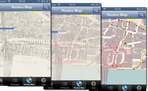
I am working on a historic map overlay, where the user can adjust the transparency of the historic map. The user can then see the how the land use has changed over time by using the slider.

opacity-map-overlay

I am going to use the map-box fork of route me. Looks like a good bug fixed version of Route-me and map-box do seem to have great some great products.

Unfortunately it doesn’t have an have an API to dynamically change the opacity of a tile source out the box. So I added it.

Its pretty easy to add. Each tileSource has a RMMapTileLayerView container when added to the map. Within that can manipulate the CALayer.opacity to get the desired effect.

I added a fork to github for testing

https://github.com/murrayk/mapbox-ios-sdk/

And example of use – the code is in github. Do a ‘git clone –recursive’ to install the submodules.

https://github.com/murrayk/mapbox-overlay-opacity-example

And example of use. In the  main view controller.

- (void)viewDidLoad
{
    [super viewDidLoad];
        // Do any additional setup after loading the view, typically from a nib.
    RMOpenStreetMapSource * openStreetMap = [[RMOpenStreetMapSource alloc] init];
    RMGenericMapSource * weatherMap = [[RMGenericMapSource alloc] initWithHost:@"tile.openweathermap.org/map/clouds" tileCacheKey:@"cloudCover" minZoom:0 maxZoom:18];

    self.mapView.tileSource = openStreetMap;

    [self.mapView addTileSource:weatherMap];

    self.overlay = weatherMap;
    // rough bb W = -30.0 degrees; E = 50.0 degrees; S = +35.0 degrees; N = +70.0 degrees
    NSLog(@"zooming to europe");
    CLLocationCoordinate2D northEastEurope = CLLocationCoordinate2DMake(70,-30);
    CLLocationCoordinate2D southWestEurope= CLLocationCoordinate2DMake(35,50);
    [self.mapView zoomWithLatitudeLongitudeBoundsSouthWest:southWestEurope northEast:northEastEurope animated:YES];

    [self.mapView setOpacity:0.5 forTileSource: self.overlay];

}

//hook up a slider to manipulate the opacity.  

- (IBAction)changeOverlayOpacity:(UISlider *)sender {

    NSLog(@"Slider value changed %f", sender.value );
    [self.mapView setOpacity:sender.value forTileSource: self.overlay];
}
If you found this blog useful, you might want to look through the archived articles on EDINA’s developers Geo-Mobile blog


Fieldtrip GB – Mapserver 6.2 Mask Layers

By Fiona Hemsley-Flint (GIS Engineer)

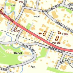
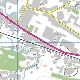
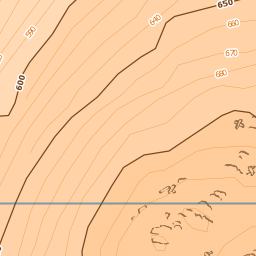
Whilst developing the background mapping for the Fieldtrip GB App, it became clear that there was going to have to be some cartographic compromises between urban and rural areas at larger scales; Since we were restricted to using OS Open products, we had a choice between Streetview and Vector Map District (VMD) – Streetview works nicely in urban environments, but not so much in rural areas, where VMD works best  (with the addition of some nice EDINA–crafted relief mapping) . This contrast can be seen in images below.

streetview1VectorMapDistrict1

Streetview (L) and Vector Map District (R) maps in an urban area.

streetview2VectorMapDistrict2

Streetview (L) and Vector Map District (R) maps in a rural area.

In an off-the-cuff comment, Ben set me a challenge – “It would be good if we could have the Streetview maps in urban areas, and VMD maps in rural areas “.

I laughed.

Since these products are continuous over the whole of the country, I didn’t see how we could have two different maps showing at the same time.

Then, because I like a challenge, I thought about it some more and found that the newer versions of MapServer (from 6.2) support something called “Mask Layersâ€�  – where one layer is only displayed in places where it intersects another layer.

I realised if I could define something that constitutes an ‘Urban’ area, then I could create a mask layer of these, which could then be used to only display the Streetview mapping in those areas, and all other areas could display a different map – in this case Vector Map District (we used the beta product although are currently updating to the latest version).

I used the Strategi ‘Large Urban Areas’ classification as my means of defining an ‘Urban’ area – with a buffer to take into account suburbia and differences in scale between Strategi and Streetview products.

The resulting set of layers (simplified!) looks a bit like this:

masking example

Using Mask layers in MapServer 6.2 to display only certain parts of a raster image.

Although this doesn’t necessarily look very pretty in the borders between the two products, I feel that the overall result meets the challenge – in urban areas it is now possible to view street names and building details, and in rural areas, contours and other topographic features are more visible. This hopefully provides a flexibility  for users on different types of field trips to successfully implement the background mapping.

Here’s a snippet of the mapfile showing the implementation of the masking, in case you’re really keen…

#VMD_layer(s) defined before mask

LAYER

…..

END

#Streetview mask layer

LAYER

NAME “Streetview_Mask”

METADATA

…..

END

#Data comes from a shapefile (polygons of urban areas only):

DATA “streetview_mask”

TYPE POLYGON

STATUS OFF

END

#Streetview

LAYER

NAME “Streetview”

METADATA

…..

END

#Data is a series of tiff files, location stored in a tileindex

TYPE Raster

STATUS off

TILEINDEX “streetview.shp”

TILEITEM “Location”

#*****The important bit – setting the mask for the layer*****

MASK “Streetview_Mask”

POSTLABELCACHE TRUE

END

International Benchmarking Review of UK Human Geography

Picked up from Kenneth Field’s Blog, the ESRC have put together a report on Human Geography in the UK. The report is co-authored by the RGS-IBG and the Arts and Humanities Council.

The report concludes that the UK ranks top in Human Geography research when measured in bibliometric data. However, the report did highlight a number of areas where there was room for improvement and one of these was Qualitative methods and GI Science (the report refers to GIS as Geographical Information Science rather than Geographic Information Systems, i prefer GI Science which is much bigger than the “Systems” of GIS). The panel calls for:

  1. an investment in training for GI Science which is currently largely seen as the preserve of the Geographer and
  2. focused investment in GIS laboratories and renewed commitment to hiring in this sub-discipline.

Geographers in the UK have made an important contribution to advancing complex modelling such as agent-baset modelling, but they have also been at the forefront of developments in 3  broad areas:

  1. Neogeography – the use of Web 2.0 mapping
  2. embracing and utalising Open Data
  3. developing innovative visualisations.

The report states that there is a small group of relatively young researchers  taking up these research activities and there is a reduction in the number of postgrad opportunities to learn the skills needed to handle and interpret large quantities of data.  I am not sure i would agree entirely.  The UK is contributing on the Word stage through groups such as CASA at UCL, the Centre for Geospatial Science at Nottingham University, Danny Dorling’s SASI group at The University of Sheffield and researchers like Jason Dykes at City University London.   These groups are small compared to other disciplines but they are growing.  CASA are particularly adept at publicising their work and gaining funding for projects working to visualise Open Data.  Students and postdocs are leaving these centres to take on new positions in different Universities (Alex Singleton was a CASA member but is now researching and lecturing at Liverpool).

Big Data

This sector is growing but growth is slow and organic. I would agree that more funds need to be injected into this area.  The skills needed to handle large datasets (eloquently described by Prof. Michael Batty as “data that is too big to load in excel” ~1 million rows). I actually think that some of the “Big Open Data” needs to mature before it is actually of any real use.  Take the London Tube system for instance, you tap in at a station with your Oyster Card, travel on the network and they tap out. But on any given day, you will have around 500, 000 more tap-ins than tap-outs. This data leak makes analysis of the traffic in the network only about 90% accurate (from Michael Batty’s EEO presentation 1/03/2013). This would most likely be considered not fir for purpose in the engineering or planning World.  The skills and tool-kits for analysing big data are emerging, but the data itself needs to be improved if it is to be useful for Building Information Models (BIMs), which seem to be the new buzz-world in commercial GIS circles.

Here is a link to CASA’s view of Big Data.

Shared Services

Well, I couldn’t really report on the document without mentioning how we see EDINA’s role in all this. EDINA is committed to offering shared services that provide access to spatial data and tool-kits to the education sector. We have seen a huge increase in the use of our spatial services over the past 5 years and analysis shows that the majority of our users are not geographers. Instead, they are environmental scientists, landscape planners, engineers and architects.

Location based services, augmented reality and the rise of the smart phone offer new challenges and opportunities. We have been working away quietly on a few things in these sectors, so expect to see something soon.


Old Maps online workshop

Old maps online launched some months back and has been quite a hit.  It essentially is a catalogue of old maps from library collections around the World.  However, it is much more than just that. Old maps online allows users to make spatial searches for maps rather than having to rely on fields such as Title, author and published date.  This is not the information that springs to mind when you want a map.  Place-names, regions and coordinates are more logical search terms.

As part of the Old Maps Online project, the  team are putting on workshops and i attended the Edinburgh event on Thursday 13th December. Edinburgh is steeped in mapping history and has one of the largest map library collections in the World.  Whats more, a significant percentage of the National Library of Scotland’s collection has been scanned and made available online for free.  The NLS have recently updated their catalogue interface and it is even easier to search and view maps.  This is a huge resource and has sparked the interest in many researchers who have utalised the old maps in their research.

The NLS site is uses software from Klokan Technologies, a small Swiss company run by Petr Pridal. Petr has put a lot of effort into improving the searching and discovery of historic maps online and it was for this contribution that he received the Bartholomew’s Globe. The Bartholomew’s Globe is an award from the Royal Scottish Geographical Society (RSGS) and is awarded in recognition of an exceptional contribution to cartography, mapping and related techniques in Scotland over a long period of years. The award was presented by Bruce Gittings, RSGS Vice Chairman.

Bartholomew’s Award 2012

The rest of the event focused on how historic maps, and historic geographical data in general, were being used in researchers. The flavor was, as expected given the location, generally Scottish, but it also brought together a mix of academic researchers, commercial organisations and enthusiastic amateurs.  Presentations that stood out included:

Alice Heywood (NLS) who described a project that got School children to develop content for mobile apps that provided historic tours of their home towns. The pilot had been run in Elgin and the children had produced some excellent narratives explaining their local historical sites and traditions.  This kind of partnership between the NLS and schools seems like an excellent initiative. Perhaps it could link in with organisations such as VisitScotland to create apps for tourists visiting Scotland. More information about the Great Escapes project can be found on the NLS website.

Chris Speed (University of Edinburgh) who discussed the “blue dot” concept.  This is really that a mobile device will represent your position as a blue dot, but using historic maps and data you can allow the user to travel back through time at a particular location. Chris has had publicity with his Walking through time app, a project which was supported by JISC and EDINA. This allowed users to view historic maps of Edinburgh and embark on guided tours through history via their mobile phones. Chris want to expand this to Glasgow, arguably a more dynamic environment which might reveal more startling change to users. I am not sure I entirely agree with Chris’ comments about connecting with individual objects such as trees which have persisted in green spaces while the build environment has changed around them.  Trees on maps tn to be representative rather than an absolute record.  However, if you are in a greenspace and faced by a tree that is clearly over 100 years old and trees are marked on the map you can believe that the surveyor stood there and added it to the map all those years ago and that tree is a link to the past environment.

There were 2 talks on mapping old transport links.  David Simpson had tried to locate roads marked on Roy’s Maps, Roy’s Roads. David found that bridges were quite reliable features of Roy’s maps and by locating these on the ground and modern maps you could then find the old road features. Many of these bridges are being lost, used only by farmers to access fields but represent an important part of Scotland’s history.  Neil Ramsay (Scotways) was working to display old path networks on modern maps.  Discovering old routes and posting them online is one way in which Scotways in encouraging people to get out and discover their local area. It was noted by a member of the audience that there was an apparent lack of paths connecting Glasgow and Edinburgh. Neil noted this and mentioned that it was certainly on the list of places to investigate, perhaps enthusiastic walkers could lend a hand.  Just go to the NLS maps page and scan through the maps to see if a path exists in your local area that is missing from the modern OS maps, then get out an see if it exists on the ground. Take a look at Scotways excellent Heritage Paths site.

There was a very interesting presentation on using Historic maps as a tool for place-name research given by Jake King (Ainmean Aite na h-Alba). Jake had used the NLS historic maps to investigate the changes in spelling of Gaelic place-names through time.

Bomb Sight

Bomb Sight

Humphrey Southall and Andrew James (The National Archives) deputised for Kate (bomber) Jones (University of Portsmouth) who was unable to travel to the event.  The Bomb Sight project maps the bombs that fell on London during the first phase of the blitz. This project digitised and mapped records held by the National Archive. These maps were previously only available for the public to view in the reading room at the National Archive.  Users can view the location of bombs and display attribute data such as the date, bomb type and, in most cases, view “nearby memories” such as audio and pictures from the archive. Users can switch between the modern map and the 1940 Bomb maps. These maps are a bit grainy and it would be great to see some crisper historic mapping in there.  The Bomb Sight project also has a mobile app that allows users an augmented reality view of the blitz. The project has done incredibly well and attracted a lot of publicity. This demonstrates the power of fusing historic maps with archived data that has never been displayed digitally.

This really summed up the event.  There is public interest in historic data and making it accessible in a digital format is the key.  Once those interested in historic data can get their hands on the digital data, they can turn it into useful information that others can enjoy or even re-appoint for other uses such as education and tourism.


Christmas gifts for geo-geeks

Christmas

There is no shame in being a geo-geek.  Geeks seem to be “in” at the moment and maps also seem to be cool.  With this in mind, you might want to send someone something map or geo related.  To help you out, i have put together a list of things that i would not be disappointed receiving myself.

  • Personalised Historic Map Mugs – An ideal gift to remember the place where memories were born! Personalise the Map (1896-1904 edition) with any postcode. Use it to show the area you got married, your first house or just that special place! Maps are available for all of England, Scotland and Wales. Enter the required post code in the personalisation field. Spotted this on the OS Blog, they have a fw other ideas for XMAS pressies, check them out
  • Map Cushion – as simple as that, a cushion with a map on it. Not cheap at £28 but quite nice.  If you know how to sew, then you could probably make one yourself.
  • Crumpled Map – a city map of London that is made of fabric and you can screw up into a ball and generally abuse without it ripping. At £9 this is a great stocking filler. Other cities are available and there are a host of great maps available on the FAB website including wall-mounted magnetic maps.
  • Mapominoes – mentioned this last year, but since then they have brought out a UK county version which will test your knowledge of the UK geography in a fun, interactive game. It is much like dominoes but with geographic areas. Add in a bit of tactics, blocking of regions with negative tactics and you have a great little game.  Priced at between £10-12 pounds and available from amazon.
  • Doodle Map – one for younger, aspiring map-geeks. Doodle maps are laminated to allow kids to write or draw on them with crayons.  They can trace routes to grandparents or mark where they are going on holiday. These would also be great as a classroom resource. £26
  • Bespoke map art – Bombus do a range of map art. You select the shape and the locations you want and you will recieve a framed picture with 3 map snippets.  I thought my sister had become ultra-creative , but now i know where she got the map art in her hallway. Busted.  Prices vary, check out the Bombus website for details. They also do some really simple cards and Christmas decorations priced between £5 and £15.
  • Map Wallet – a gift for him, a quality leather wallet that has a map lining, for the subtle map-geek (£35)
  • Map Wallet 2 – a cheaper option with even more map! The Explorer Map Mighty Wallet features a map of the beautiful Alaskan glaciers and is made from a single sheet of super-strong Tyvek that feels like paper but is virtually indestructible. (£11)
  • Old Maps – old maps make a great gift and you can pick them up for under £5.  Just pop into your local charity shop and see what they have in.  I love the old Bartholomew’s maps and at £4 for a map printed on cloth they are a steal, plus the cash goes to a worthy cause.

And then there are book:

  • On the Map (Simon Garfield) –  examines how maps both relate and realign our history. His compelling narratives range from the quest to create the perfect globe to the challenges of mapping Africa and Antarctica, from spellbinding treasure maps to the naming of America, from Ordnance Survey to the mapping of Monopoly and Skyrim, and from rare map dealers to cartographic frauds. £17.
  • Map Addict (Mike Parker) – a couple of years old now, but still a great present for a map geek. Mike explores his own love affair with the map in his own humorous way. £7.
  • Atlas of Remote Islands – On one page are perfect maps, on the other unfold bizarre stories from the history of the islands themselves. Rare animals and strange people abound: from marooned slaves to lonely scientists, lost explorers to confused lighthouse keepers, mutinous sailors to forgotten castaways; a collection of Robinson Crusoes of all kinds. Recently awarded the prize of Germany’s most beautiful book, the Atlas of Remote Islands is an intricately designed masterpiece that will delight maplovers everywhere. Judith Schalansky lures us across all the oceans of the world to fifty remote islands – from St Kilda to Easter Island and from Tristan da Cunha to Disappointment Island – and proves that some of the most memorable journeys can be taken by armchair travellers. £16
  • Scotland – Mapping the Nation – Compiled by three experts who have spent their lives working with maps, Scotland: Mapping the Nation offers a fascinating and thought-provoking perspective on Scottish history which is beautifully illustrated with complete facsimiles and details of hundreds of the most significant manuscript and printed maps from the National Library of Scotland and other institutions, including those by Timothy Pont, Joan Blaeu and William Roy, amongst many others. £20
  • Wild Vision – mot really a mapping book, but i am sneaking it in as i went to a talk by John Beatty last night and his images are stunning.  They depict the natural world in a clarity that few are lucky enough to witness first hand.  Many images were captured with film SLR cameras in harsh conditions but are still pin-sharp.His book celebrates the natural world and costs £25
  • Cool cloth with map– I spotted a lady at a recent conference with  a very cool map-print skirt.  She bought the fabric and had it made up into a skirt.  I suppose you could get the fabric and make anything you want, cushions  bags, curtains. It is a liberty print, so i have been told, but is seems to be out of stock.

    Map Skirt

SplashMaps – tough and usable maps

Maps are great, we use them to help us navigate around spaces. These spaces tend to be outdoors and the weather is not always conducive to unfurling a massive sheet of paper. In my opinion, maps need to be tough. That is why it is nice to see a start-up that is trying to produce maps on fabric, a technique that was used widely by the armed forces during WWII.

I don’t usually give shout-outs to ventures like this, but this one is using Open Source Data and is trying to make nice, usable maps printed on fabric.  I hope they raise the money they need to get going, i would certainly like to have a fabric map in my collection. If you are interested, please read the overview below and click the link to the SpalshMaps project page on Kickstarter.

SplashMaps – pic courtesy of SplashMaps

“A SplashMap is a map printed onto a fabric, and like its inspiration (the escape and evasion silk maps used in the second WW and distributed around the continent in Monopoly boxes) they are light-weight, durable, washable, wearable and ideal for the “real” outdoors of mud, wind, snow and rain… all the conditions that paper is not “cut-out” for. This is a fresh new market offering, never done before; uniquely based upon the best Ordnance Survey data and other Open Data Sources. We are able to tailor these maps to be the most usable outdoor maps ever for walking, riding, cycling, eventing or anything you could do in the real outdoors.”

The true size of Africa

The true Size of Africa

Maps have long been the preserve of the “Old World” and we like nothing more than putting ourselves at the centre of the map and making ourselves look big and important.  Representing a 3D object in 2 dimensions is not a simple task. Projections usually distort some areas of the globe in order to represent the World in a rough rectangle.

The Gall-Peters projection aims to represent land mass area reliably and results in an odd view of the World.  Odd, in that we are just so used to seeing land area distorted in-favor of the Northern Hemisphere.  Gall came up with this projection in 1855, but it was popularised by Peters in the 1980′s to highlight the misrepresentation and self importance of developed nations.   Most maps will show Greenland as being about the same size as Africa but it is actually 14 times smaller.

Today there is an article doing the rounds that reports the “true size of Africa”.  I picked this up from the Economist, and it shows the continent of Africa compared with a number of countries.  It is an eye-opener.  You can easily squeeze China, the USA, India and most of Europe into Africa and still have room to slide Japan in for good measure.  Africa is huge. Maps lie, or rather, we make maps for a purpose and this often emphasises a feature at the detriment of others we are less interested in.

The image has been released under a creative commons licence which is great.  You are free to download it and re-use it.

Economist article

Creative Commons Image